Website trends come and go, but some old-school best practices endure well past their expiration and age just as well as cheap wine or day-old bread. Our website myths series helps agencies find a better path to website usability and relegate outmoded myths to the rubbish heap of history. In this installment, we tackle myth #4 – icons enhance website usability.
Websites have evolved from digital file cabinets filled with long pages of text to more visual, easier-to-read online portals to information. The growing popularity of apps and mobile devices have increased the use of icons in website design in order to save space and create visual balance on a webpage. Because of this, it’s a common misconception that icons are becoming superior to text labels. While icons can make a webpage look more visually-pleasing, I argue that text still matters.
Not everyone infers an icon’s meaning the same way as you initially intend them to. A user’s understanding of an unfamiliar icon is usually based on past experiences with that icon or one that’s similar. Without this familiarity, the user won’t be able to understand the icon’s meaning. Furthermore, research has shown that it’s difficult to memorize icons, and they’re often inefficient and ineffective at communicating the core message.
Engineering Psychologist and UX expert, Michael Zuschlag, states that “icons contrary to intuition, do not necessarily help the user find a menu item better than a text label alone.” As an interesting example, when Microsoft Outlook released a new user interface, usability tests revealed people weren’t using the icon-only toolbar. So, they tried several possible fixes, including new icons, rearranging the icons, and positioning them under menus from which the commands came. With each change, the same behavior resulted: people didn’t use them. Finally, they decided to place text labels next to each of the icons. This was the magic fix, and people began using the toolbar.
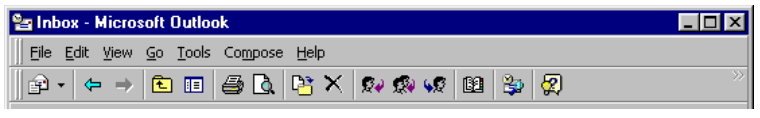
Without any text labels, users found it difficult to understand the purpose of each icon in the Microsoft Outlook ’97 toolbar. Thus, they didn’t end up using them.
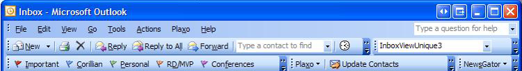
The toolbar in Microsoft Outlook 2003 got a facelift with text labels beside each icon, making it easy to instantly understand what each icon does.
What Microsoft discovered – and what’s consistent with our experience – is icons alone can be confusing because most don’t hold universal meaning for users. To enhance usability, our best practices say that you should generally use icons in conjunction with text labels. Because there is no standard usage for many icons, text labels are essential to communicating their meaning or intent and reducing ambiguity or confusion.
The homepage of Augusta County, Virginia features some of the county’s most frequently requested services. Rather than simply using image icons for each of these services, notice how they coupled them with text labels, making it easy for users to instantly understand the meaning behind each icon.
Augusta County’s homepage showcases 6 of the most frequently requested services as buttons with icons and text labels.
Similarly, the Town of Breckenridge, Colorado also features their most requested services right on their homepage. Instead of icons with labels, however, the Town created simple, straight-forward text buttons that reveal an icon only when a user hovers over them, avoiding any confusion or ambiguity.
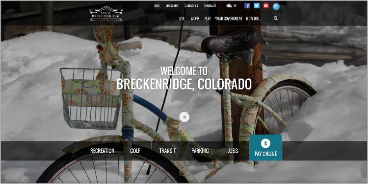
The Town of Breckenridge eliminates confusion by creating straightforward, easy-to-read text buttons on its homepage to the most requested services.
While general icons should come with labels, there will be some icons that are universally recognized and can stand alone. On modern websites, social media icons fall in this category.
For this reason, The City of Olathe, Kansas utilizes a combination of icons on its homepage – some with labels and others without. Common social icons (Facebook, Twitter and YouTube and email) indicate the different ways a resident can connect with the City online without the need for a text label.
The City of Olathe, KS strategically uses a combination of icons and labels on its homepage.
When used correctly, icons alone can effectively communicate the core message, idea or intent. Before you jump into using them across your entire website, ask yourself:
If you have any doubts, you should test your icons for usability before putting them anywhere on your site without associated labels.