Website trends come and go, but some old-school best practices endure well past their expiration dates, and age just about as well as your middle school mullet. Our website myths series helps agencies find a better path to website usability, and relegate outmoded myths to the rubbish heap of history. In this installment, we unravel one of the longest-standing myths – The Three Click Rule.
“If you have something important on your website, it must be reachable in three clicks.” So goes one of the oldest, and hardest to kill UX myths of the internet age. While it is important to design easy, understandable pathways to information, the three click rule just doesn’t hold up.
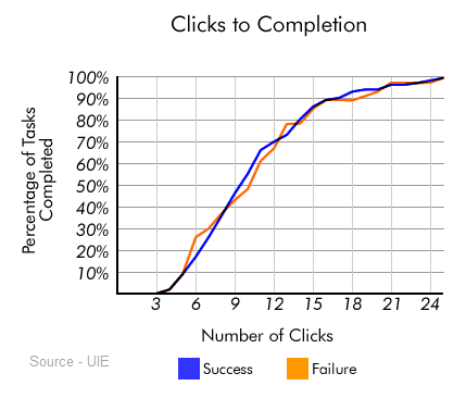
Way back in 2003 Joshua Porter published an article for UIE debunking the rule. In it he explained a test that analyzed 44 users attempting 620 tasks and showed no drop-off after the magic third click. In fact, most users kept clicking until they completed their task.

Finding no support for the three-click rule, Joshua and team tested satisfaction to see if it dropped off after three clicks, and found no evidence for that either. They concluded that people complain about clicks when they’re really upset about not finding what they seek. He explains:
“We see this phenomenon quite often: users complain about a symptom and not the real problem that caused it. They want to explain why they are failing, and in this particular case, one of their initial thoughts is that they are clicking too much.”
The solution is not to limit the clicks, but to make things easier to find.
When thinking about click progression, Steve Krug’s book title says it all: “Don’t Make Me Think.” Click progress should feel natural and not like a puzzle to solve. When Joshua Porter and team say complaints about too many clicks are about the symptom and not the problem, it boils down to the fact that at each stage, users will happily continue to click if they understand the content. Show them they’re making progress and make them feel like they’re on the right track.
This is where UX and Content Strategy can work together. By putting yourself in your users’ shoes, you can create content that anticipates what’s needed most – and minimize clicks in the process. When planning buttons and navigation, take a look at your site’s data to get insight into what users seek most. Then, you can design your site to highlight those pathways and make it easy for users to proceed successfully.
Consider:
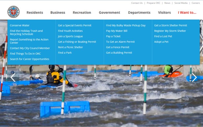
Other research conducted by usability expert Jared Spool suggests that long descriptive links – 7 to 12 words is the optimum length – can help users understand where they’re going.

Oklahoma City, Oklahoma uses navigation that reflects top requests and longer link text to improve clarity.
Just because the three click rule has no merit doesn’t mean you should force users to click a bunch of times. Instead, plot out pathways that show progress and reflect user priorities. Many studies beyond the UIE one have shown that users will click and click if they feel they’re following the right track. If something needs to be seven clicks deep, that’s okay. But if it’s your website’s top request, you may want to consider how to shorten that distance.
Has anyone at your agency ever told you to follow the three clicks rule? The bottom line is that there is no magic number of clicks as long as users find what they want without expending unnecessary effort to get it. Focus on your users’ needs to guide you in finding the best approach.