TL;DR. The same features and functionality you love with a new look and feel.
Get excited: govAccess, Granicus’ government website design software, is getting a facelift. When you log in to the system at the end of August, you’ll notice some new colors and the Granicus logo in the upper left corner. Don’t fret, though. All the features you’ve come to know and love aren’t going anywhere. In fact, everything will remain in the same spot.
Why the change? Granicus products are meant to provide a seamless experience not only for citizens, but for the end user: you! The new colors are less distracting, so you can focus on functionality first. These changes also help align the system with the branding of other Granicus products.
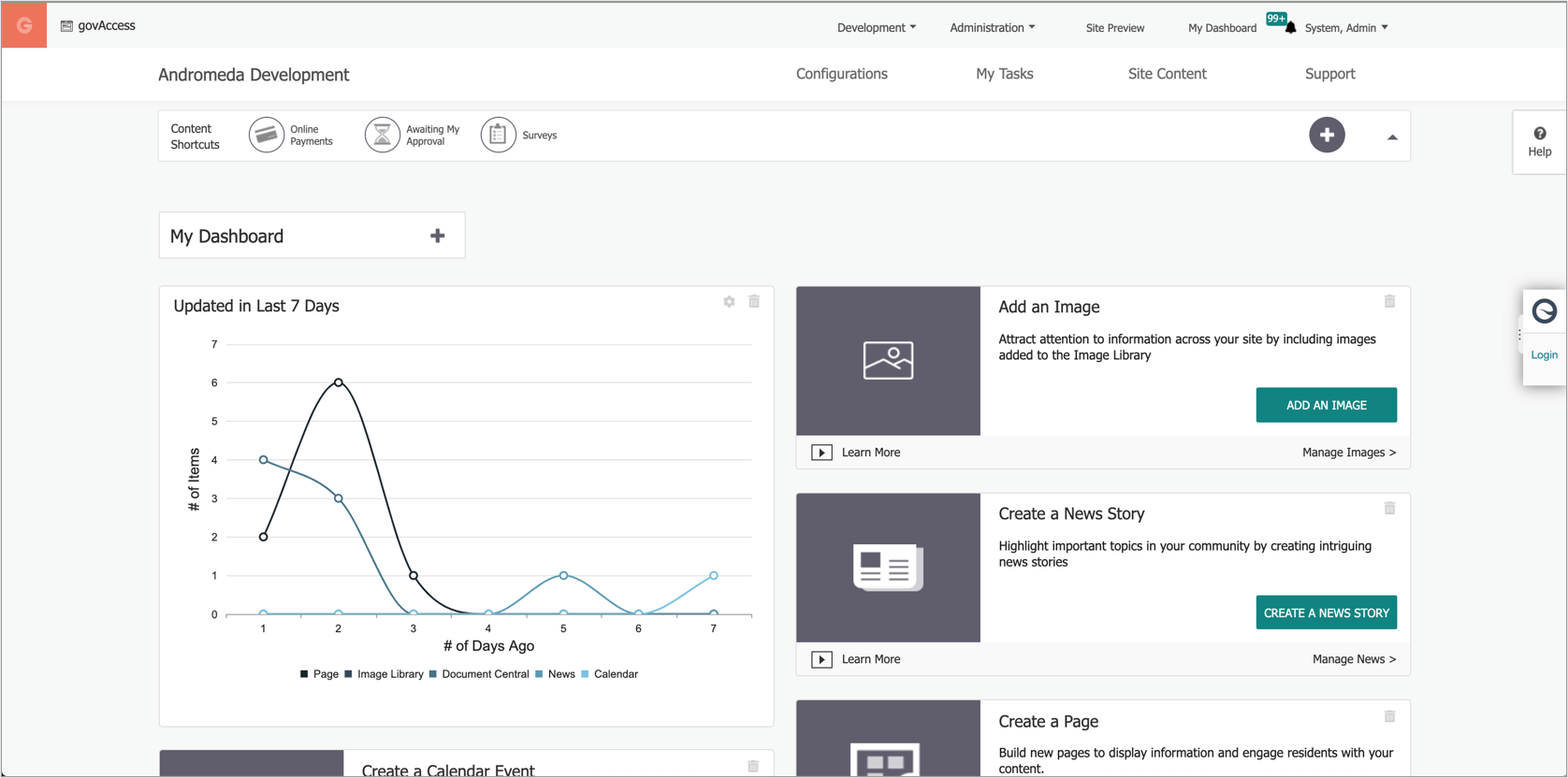
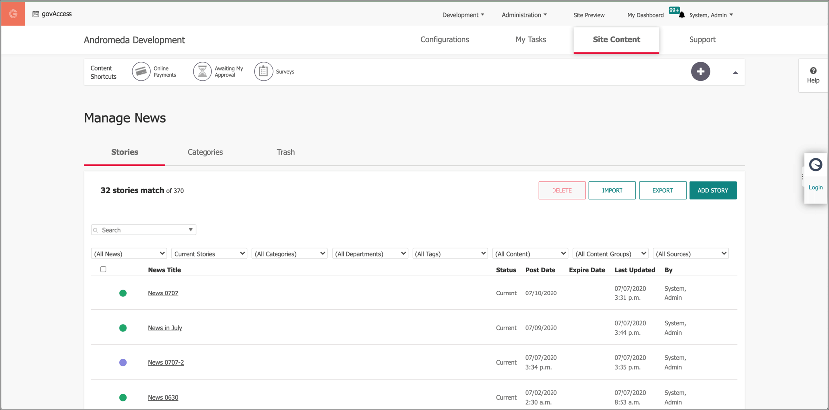
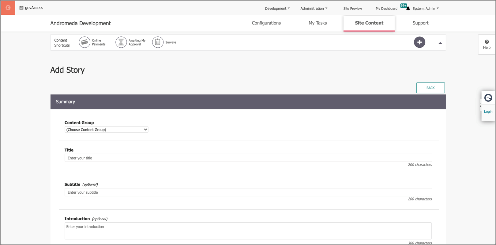
Check out a sneak peek of the changes below.
Updated Dashboard Screen

Updated Manage View

Updated Add View

If you’re a current govAccess customer and have any questions about these changes, please reach out to the Granicus Support Team.
Learn more about how govAccess can seamlessly connect your constituents to your staff.>>