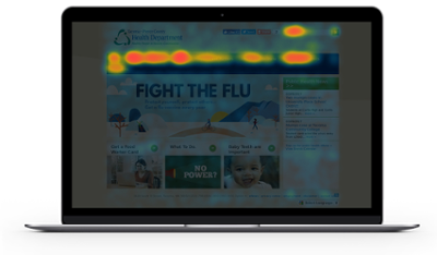
Each of our website clients engages us for unique reasons and are often in different maturity levels in their digital lifecycle. For this edition of our Digital Experts Corner, we’ve interviewed Tony Ohrazda, Project Manager for the Tacoma-Pierce County Health Department (TPCHD), about their website redesign project with Granicus.
Their story is interesting for a number of reasons. First, the agency is charged with delivering health services to both the city and county. Second, they have recently signed the contract for their website-redo, so they are deep in the planning stages for their implementation. Third, with federal healthcare programs in flux, health department services delivery has become increasingly crucial for local governments.
Overall, I thought it delivered a poor user experience because the aesthetics were dated. The CMS was about 12 years old and lacked modern functionality like the ability to conduct polls, e-commerce, update news or blog. Our clients had difficulty finding information and much of the information wasn’t current. Moreover, it lacked any thought when it came to standards like WCAG and Section 508.
No, there was already a team and executive sponsors in place when I joined. I think they reached the point where they knew that they needed someone to reign them in (laughs). They had already conducted an request for information (RFI) and had written an initial request for proposal (RFP). I helped revise the RFP and then ran the process including scoring the responses and interviews. Because I ran the process, I recused myself from voting.

The project was award to Granicus for several reasons:
The depth and breadth of the content and services TPCHD offers to a highly diverse population are immense. Because of this, we need to be nimble. Accordingly, because TPCHD is so flexible is that we are often tapped to deliver new services like the Food Worker Certification Program. Overall, TPCHD is primary or a supporting agency for various health functions. For example, we are a regulatory agency for areas like food inspection and environmental health. We also offer vital record services to residents such as birth and death records. Finally, TPCHD provides information on disease and immunization, like flu shots.
It’s probably easier to list who isn’t a client, but seriously, any resident of the Tacoma-Pierce community. Industries and educational institutions that operate within the community that we regulate. And our partner agencies at the federal, state and local level.
Analytics will guide us to what pages clients are hitting now. Our most popular pages are the Food Worker Certification Program, Septic Systems and Mumps and Flu info. I think our main navigation will need to remain static, but we’ll use the flexibility of the optional buttons to serve our changing needs as we move forward. I think all the programs managers will want their programs ‘on’ those buttons. It’ll be interesting to figure out what goes where. The next big step is rewriting all of our content to get our readability score down. There’s a lot to do, and we hope to go live before the end of the year.
A few things:
Frankly, we are hoping that the website can serve as a “front counter” for all the services we deliver.
Thanks Tony! We look forward to checking back after your new site is deployed.
If you are interested in learning more about accessibility, download our Digital Accessibility Checklist to ensure your website remains compliant.