When it comes to links, using the right words or phrases matters. Have you ever come across click here links? It can be confusing about what the link is or where it will lead you. While this may seem like a good phrase to use to make it obvious for users to click a link or button, using “click here” is actually bad for usability, accessibility and search engine optimization (SEO). Specifically, here are 3 reasons why links that just say “click here” are bad.
In our Busting Website Myths blog series, we explained that people don’t read everything on a web page. Instead, they’ll scan the page to look for keywords, meaningful headings, and links.
Simply using “click here” doesn’t explain what the link is or does, and it forces users to read around the link to figure out where it will lead them. Furthermore, “click here” is ambiguous on its own. A link’s text should explain what users are clicking, give them an idea of where it will take them, and help them understand the context of the link. Consider using short, yet descriptive words to clearly explain what the link is or where it will lead site visitors.

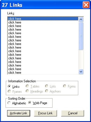
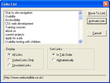
Screen readers will pull up a list of all links on a web page so the user can go through and click on the ones that would provide them with the information they seek. A list that just contains a list of click here links is useless to the user. Similarly, for those who are visually-impaired, the screen reader will read the text on a web page aloud. If all of your links are the same and use “click here”, you can imagine what that list would sound like.


“Click here” forces these users to re-read or listen to the page again in order to establish context for links.
More and more users are accessing websites on mobile or tablet devices. The phrase “click here” is restrictive because it shifts the focus to the user’s mouse. However, it ignores other means of website navigation – such as mobile screen taps, keyboard navigation, or voice recognition. Furthermore, it implies that these modes are not supported.
Most people generally know what a link is, what it looks like, and what will happen when they access it. Calling attention to the mechanics of the link is unnecessary. Instead of using the word “click,” consider an action verb that relates to the task.

Download our Accessibility Checklist for some best practices and tips to ensure your website stays compliant.