Website trends come and go, but some old-school best practices endure well past their expiration dates, and age just about as well as your middle school mullet. Our website myths series helps agencies find a better path to website usability, and relegate outmoded myths to the rubbish heap of history. Today we’ll examine a common myth: Empty Webpage Space is a Waste.
Simply put, white space (or negative space) is the spacing between different elements on the website that contains nothing. Contrary to what one might think, white space doesn’t necessarily have to be white. In website lingo, it simply refers to the empty space around design elements or a page layout that can positively affect your site’s readability. Examples of whitespace include:
In an effort to share information with the public, many local government web managers have forgotten the importance of protecting the white space on their homepages. While on the surface it may seem placing information on the homepage means it will be more frequently seen, overcrowding this area will actually make it significantly less useful and usable.
White space is as important as the content on your page. In fact, it’s an essential design element that creates balance and readability. Just as white space can draw a reader’s focus to specific content, it can also help guide the reader’s eyes from one point to another. Additionally, white space provides:
Don’t confuse or distract your readers with unnecessary clutter. Help them focus on their goals by:
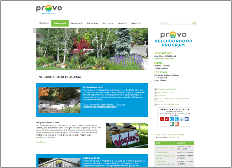
The City of Provo, Utah adds plenty of white space on its pages to separate different topics, images and widgets. The reader can easily scan this page to find specific information like who to contact, types of neighborhood events, and related neighborhood topics.
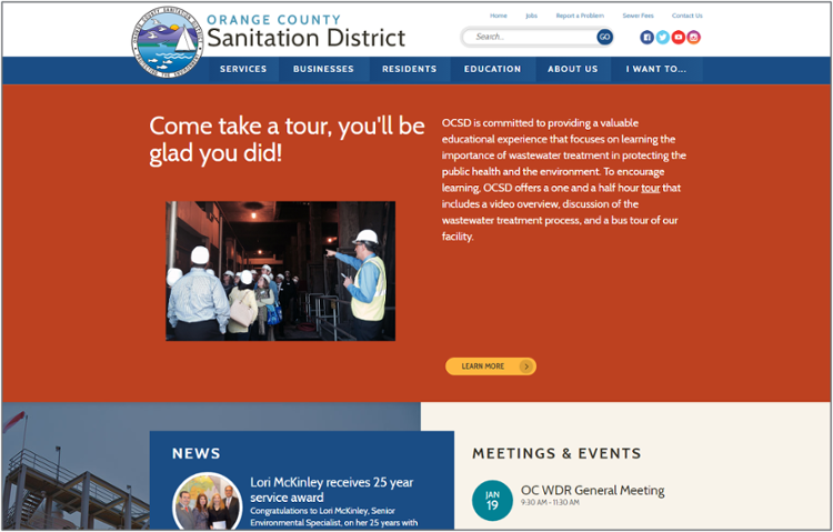
Call-to-action buttons don’t necessarily need to be big or flashy to capture the reader’s attention. Having a good amount of padding around the button – like the “Learn More” button on the Orange County Sanitation District homepage – can be enough to make it stand out.
When used correctly, white space can improve user experience, create visual balance, and guide the reader throughout your website. If you’re considering a redesign but don’t know where to begin about using white space on your website, contact us to schedule a consultation to see how Granicus can help.