People visit local government websites with specific goals and transactions in mind. If your website is difficult to navigate, frustrations and distrust in your agency can arise. A user experience (UX) driven approach to website development can uncover greater insight to why people are visiting your website and what they seek, to help you build a more service-focused website.
Local governments often think that they have an idea of what residents expect, want and need. Because of this, websites can become littered with content, difficult to navigate and deter residents from using the site at all.
Yuma County Thinks Like a Customer Service Department
Yuma County, Arizona has a rich and colorful history with a vibrant community and thriving economy. Its beautiful valleys, clear skies and lush fields attract 90,000 sun-seeking Winter visitors (also known as “Snowbirds”) each year. To ensure it could keep up and meet the needs of these annual visitors as well as its residents, the County decided to develop a customer-focused website that welcomes visitors and keeps them engaged.

Website analytics and extensive user experience (UX) testing revealed 90% of site visitors ended up viewing just 10% of the content. People want to get in and get out as quickly as possible, and if they’re unable to find what they need, they’ll leave and never return.
Yuma County’s Communications Director, Kevin Tunell, envisioned four levels of quality service via the website:
- Immediate service via online chat
- Online service request forms
- An online service directory to enable residents to contact staff directly
- Social media pages for ongoing engagement
Provide Personal Assistance
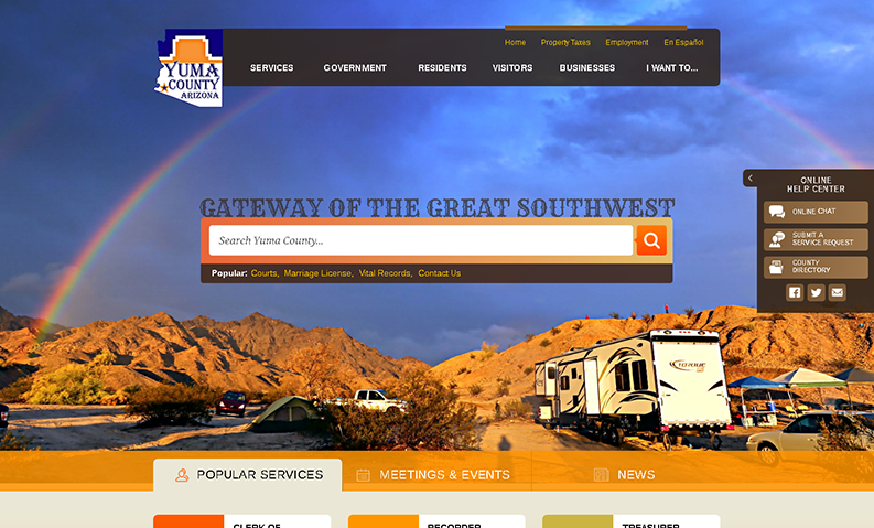
Online service request forms promise a quick response time of 24 hours, while an integrated online chat feature provides immediate personal assistance. An “Online Help Center” widget appears on every page of the site to ensure visitors have a way of asking questions if they’re unable to find what they need.
Create Easy-to-access Homepage Buttons
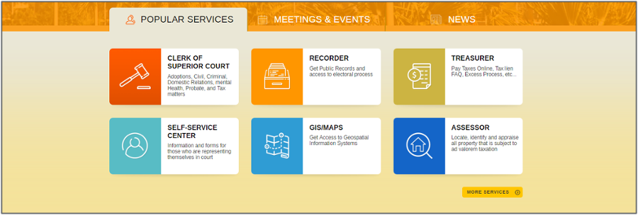
Further UX analysis revealed the most popular services that residents request, which were translated into prominent and colorful homepage buttons, enabling visitors to access information quickly and easily.

“Analysis of our existing website and community gave me the UX data to demonstrate more clearly why we were making certain decisions about design and navigation.” – Kevin Tunell, Communications Director
How will you approach your website redesign?
Download the full case study to learn more about Yuma County’s website redesign project. If you’re considering a website redesign but not interested in guessing what information your residents want to see, contact us to schedule a consultation to learn how Granicus can help.


