A user-experience (UX) driven approach to government website development requires shifting discussions about the website’s key content and layout away from the perspective of internal staff and focusing on the perspective of resident-customers. What makes sense to them? What information do they seek? Usability.gov summed it up well when they said:
“User experience (UX) focuses on having a deep understanding of users, what they need, what they value, their abilities, and also their limitations.”
All too often, local governments develop their websites based on their staff’s opinions about what information to include. Unfortunately, because staff are integrally involved in the day to day operation of government, it can be difficult for them to take a step back and think like a resident. As a result, websites are often difficult to navigate for residents who are unfamiliar with the internal structure of their city and county governments. In fact, Accenture’s Digital Government Survey indicated “poor website organization” was one of the most significant obstacles citizens face when trying to use digital government services.
Shifting the focus to user experience requires studying how residents actually interact with and use local government sites. Then, developing the framework of the site to better serve their needs.
Calcasieu Parish Shifts Focus to Resident Needs
The state of Louisiana is divided into 64 parishes in the same way that other states are divided into counties. Calcasieu Parish is the 7th largest parish in Louisiana with a population of nearly 200,000 and includes the metropolitan area of Lake Charles in western Louisiana.
Create homepage buttons for common tasks
Like many teams charged with upgrading their agency’s website, Calcasieu Parish’s team went into the redesign process with some ideas about what they thought their citizens wanted based on their current site. An internal survey of staff revealed they believed the most important items to feature on their website were:
- Minutes
- Agendas
- The local government TV channel
Fortunately, their development process included an extensive user experience analysis that included surveying their citizens, analyzing their website analytics and capturing user heat maps in order to validate their assumptions. This process revealed a very different picture of what information was actually being utilized and sought by residents. The top three reasons people were coming to the site were actually:
- GIS Information
- Permits & Forms
- Job Information
Incorporating Solutions Based On Data
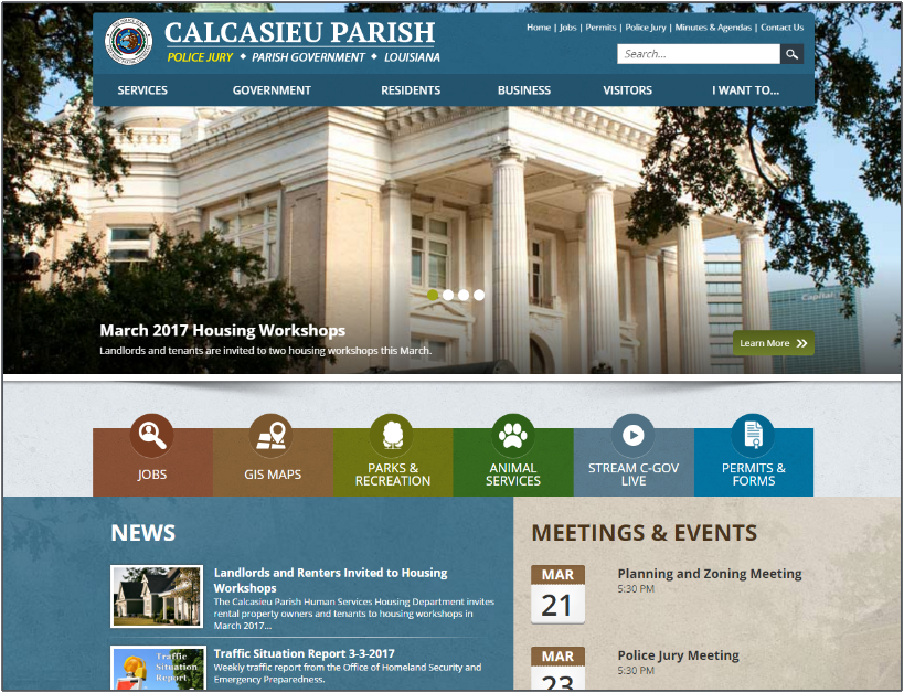
Based on what they uncovered during the research phase, the primary buttons on the new website’s homepage were set up to provide simple, one-click access to the most frequently requested pages.
“Most local government officials want their website to prominently position what they feel is most important. But, the research didn’t back up all of our assumptions.”
Tom Hoefer, Director of Communications & Media
This was particularly relevant to the Permit & Forms information that was previously very difficult to find. While the internal staff knew where to click to find the page, the average person would have no idea that they had to click on Departments, then Division of Planning & Development and then Permits to get to the proper page. By placing a Permits button on their homepage, they drastically increased the usability and made permits easy to find with a single click.
Because the new website is equipped with Analytics, the team will be able to monitor top content over time and make adjustments as needed.
Provide a Better Mobile Experience
Calcasieu knew that a large number of their residents were using mobile devices to access their website, but they didn’t realize that more than 45% of the visits were made using mobile devices until they analyzed their website statistics. To address the needs of citizens using smartphones, the Parish opted for a customized app-like homepage to provide a better user experience.
By taking a User Experience focused approach to their development, Calcasieu Parish was able to create a website that more effectively served their community by structuring the website to quickly and easily guide residents to the information they sought.
How are you going to approach your website redesign?
If you’re interested in learning more about the website redesign project at Calcasieu Parish, read their full UX case study. If you’re considering a redesign and don’t want to guess about what information your residents want to see, contact us to schedule a consultation to learn how Granicus can help.


