
Let’s face it, your urge to put 2020 in the rear-view mirror is probably strong. But to do so would overlook the innovation, adaptation, and trailblazing that a year steeped in crisis created.
Citizen engagement proved more vital than ever in 2020 as large parts of the population relied on digital communications for critical aspects of their daily lives, let alone emergencies and other events. The metrics surrounding those digital communications were equally crucial, providing insights to the often-vague differences between successful and unsuccessful communications projects.
As we move forward into 2021 and begin incorporating lessons and efficiencies created in the past year, metrics remain a backbone for developing impactful communications and gauging the impact of messaging on an audience.
And, as with every year, government communicators find themselves asking the common questions that come with digital metrics:
Our series of Citizen Engagement Benchmarks helps answer these questions by diving into the reporting data from the various Granicus digital tools used by governments to digitally communicate with their citizens.
About Our Data
The metrics in this report are based on annual data gathered between June 2019 and December 2020 from the 4,500 U.S. federal, state, local, and transit (SLT); and U.K. organizations that use Granicus’ govDelivery, govAccess, and govService solutions. For email metrics, figures represent the median. A single, overall figure is provided for each U.K. metric.
The information gathered reflects 1.6 million emails sent to, as well as activity among, 250 million citizen subscribers.
Email open rate reflects the number of recipients who received and opened an email, compared to the number who received it but did not open it.
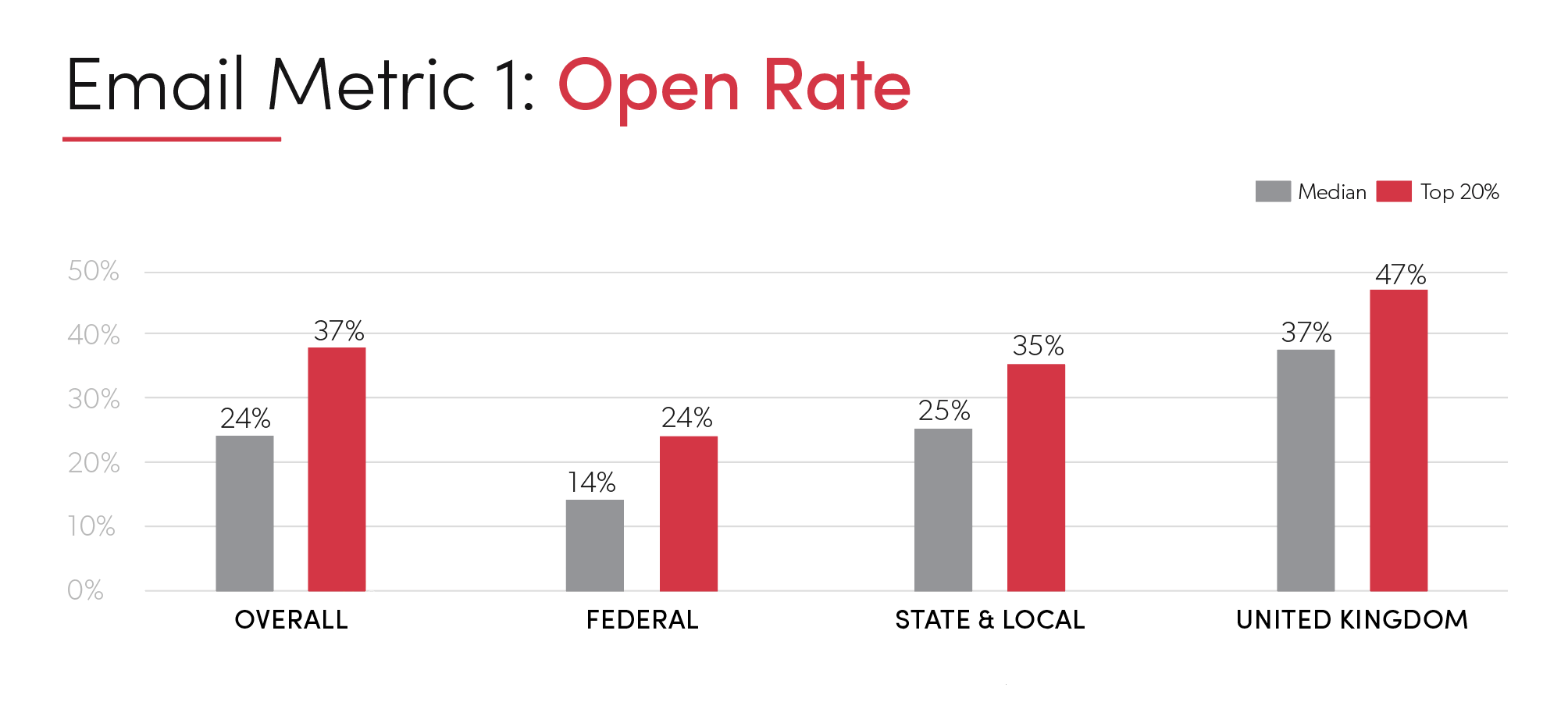
While email open rate seems like a straightforward measurement, it’s not always comprehensive. Open rates can sometimes be affected by images not being downloaded in emails. Many stats are tracked this way by using pixels embedded in emails.
Open rate numbers can best be used to understand the effectiveness of consistent messaging over time, determining which strategies for email work best. Last year, the difference between median rates and those in the top 20% averaged roughly 10% in each of the three government levels.
Low open rates, however, may not necessarily mean a missed communication. A large percentage of information sent from public sector organizations can be consumed without being opened. Weather alerts, transit route changes, or other emergency notifications can often be conveyed in a subject line and encourage your audience to act without opening the email. For that reason, when developing your strategy, it’s important to identify whether or not open rate is a key factor you need to measure for success.
If open rate is success metric, the consistency of the gaps in our benchmarks suggest that there are factors that can make emails more likely to stand out and increase open rates. One of the most important factors is the email subject line. Taking the time to create a subject line that “hooks” the reader or captures their attention in some way, while still reflecting the proper tone and persona of your organization, can have a dramatic impact on open rates.
Other factors impacting open rates include sender information, time of delivery and quality of the subscription list.
Click rate refers to the number of recipients who clicked on a link within an email compared to the total number who received the email.
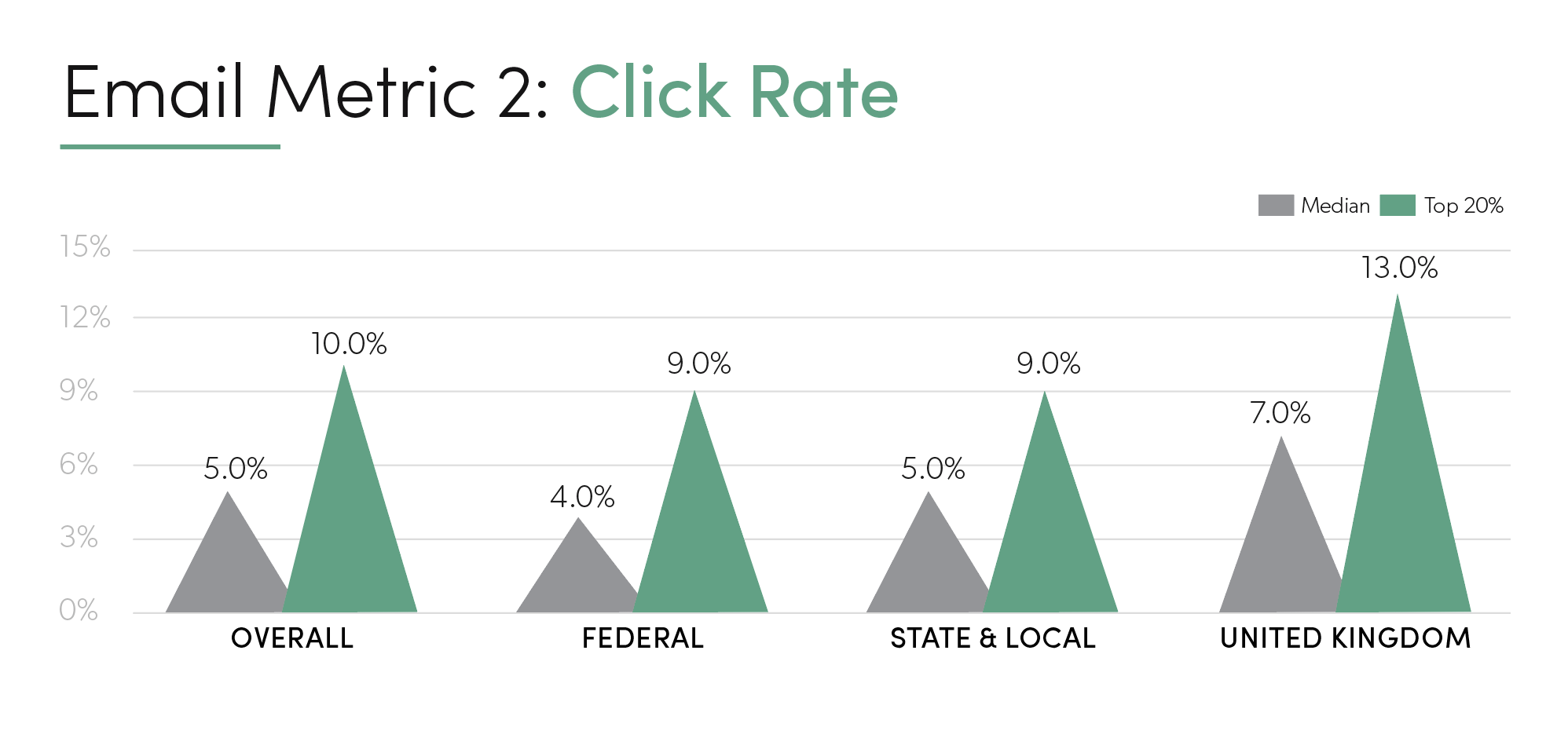
Click rate can offer more insight than open rate for certain types of emails because it shows that someone has taken an action after opening the email. Knowing what readers have clicked on can help you understand which messages spur people to act.
The gap between the median and top 20% of click rates for our government clients ranged from 4-6%, a slightly narrower gap than the gap in click rates.
Still, this gap suggests the impact of taking a focused strategy to the messaging within emails and testing which messages spark a response. While many public sector emails are solely informational, with topics such as benefit enrollment notifications and calendar reminders, these types of messages can be analyzed for engaging messaging, even if click rate is a less-reliable indicator of audience reach.
Engagement rate refers to the number of unique email recipients who opened an email or clicked on a link in an email over a 90-day period, divided by the total number of email recipients who received that email during that time period. In short, engagement refers to the percentage of recipients who actually engaged in some way with an email.
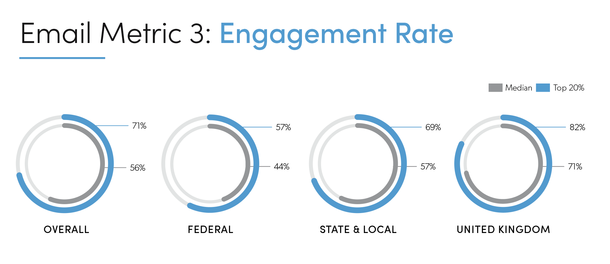
Perhaps the most important metric for consistent communications measurement and monitoring, a steady or growing engagement rate can be an indicator of impactful digital communications, especially if the total reach of communications grows alongside it.
Last year, engagement rate was one of the areas where we saw the greatest gap between the median and top 20% of users. Regardless of government level, that gap was in the double digits, with the overall gap reaching 19%.
Those results suggest that while open and click rates might be strong, many organizations are still not taking opportunities to get more impact out of their communications. Testing, review, and analysis are three keys to driving up engagement rates. And, as with all good things, it can take a little more time.
One place to start digging in for better engagement is the audience. Review the audience segment targeted by the messaging and ask if the audience is the right fit for this message. Do they truly care about the subject? Are they being emailed at the right time of day? Is the tone of the messaging one that appeals to the audience segment?
A/B testing helps compare approaches to this audience and can show that even when two different emails may seem very similar, small changes can make a big impact for engagement. A/B testing is one of the many useful tools available in govDelivery Communication Cloud’s Advanced Package.
The number of different topic-related emails an individual has signed up to receive. This is calculated by dividing the total subscriptions by total subscribers.

Audiences have varied interests. Governmental email marketing should have various topics to meet those needs. For all government levels in our 2020 data, though, the idea of providing channel-specific emails and messaging is an area still not fully embraced. The gap between the median and top 20% of users is more than double at the federal level, and almost double at the state and local levels.
Just as everyone doesn’t always like the same one thing, email marketing strategy should never rely on a single email signup list for reaching digital citizens. While your citizens might be interested in receiving information about your state or city activities, they’re more likely to engage with information relevant to their interests.
The people who want to hear about city council meetings and road construction projects may not be the same ones looking to engage with messages about events at the local park or news about the animal shelter. Burying the one or two areas of interest for a particular reader in a lengthy email dominated by other topics will always have a negative impact on overall engagement.
Freedom to make choices about what ends up in their inbox is key to ensuring citizens are getting the messages they want, when they want them. One way to check the effectiveness of the information your organization is putting out is by tracking subscriptions per subscriber. This will both show you where your citizens’ interests lie and give you an insight into development strategy for new content channels that will, in turn, increase engagement and subscribers.
An overlay is the small pop-up window that first-time or repeat visitors see prompting them to act (for example, asking them to sign up for email newsletters). Overlay impact is determined by dividing the total number of subscribers gained through the overlay by the total number of subscribers added through direct signups.
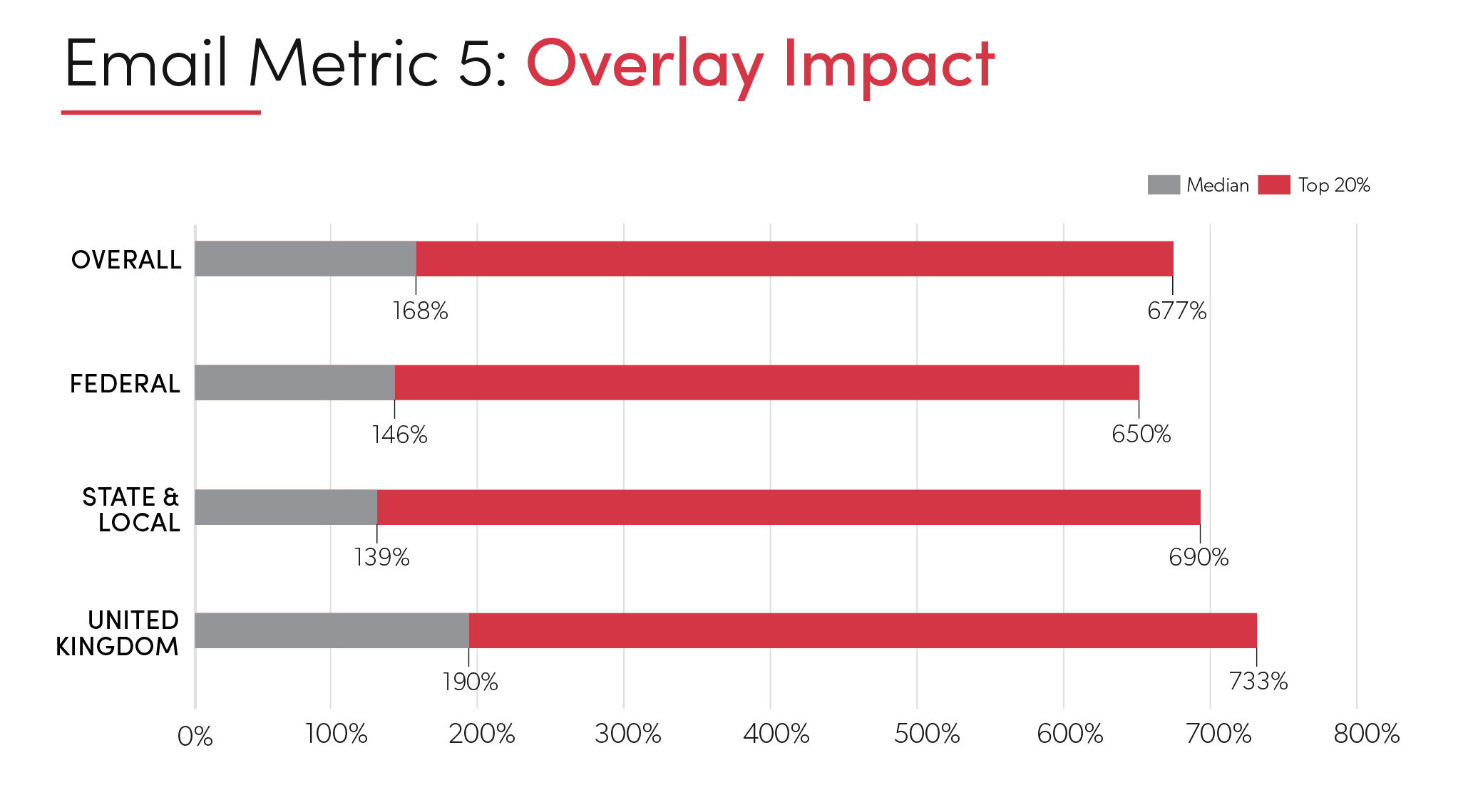
There’s a reason that overlays continue to be a strong presence in all manner of digital communications. The best overlays combine an important, focused message with a clear next-step request front and center for users in a way that can’t be missed.
Overlays continue to offer a fast and effective method of growing a digital audience. Overall, 2020 data shows that overlays had a 168% impact on subscriber growth. But what’s more impressive is that the top 20% of users saw an overlay impact of almost 700%.
The most effective overlays follow the same tactics used in other areas of email marketing: well-timed, concise and on-tone messages delivered in a timely manner with easy-to-understand action steps. Taking the time to understand audience segments, changing the messaging to stay relevant and up-to-date, and choosing how often to rotate that messaging can also make a major impact.
That doesn’t mean annoying visitors with constant overlays. Overlay options in GovDelivery make it easy adjust settings to reflect changes in strategy, update messaging, and even make sure that once a visitor closes the box, they never see it again.
Metrics may come after a project has been executed, but metrics should also be considered a top priority when planning new projects. By identifying the metrics you hope to impact, you’ll soon find it easier to create communications with a reader’s needs and interests in mind.
If your organization isn’t already engaging in metric-driven analysis of communications projects, learn how govDelivery can deliver the tools to take your digital communications to a higher, data-driven level.