Would it surprise you to know that people’s expectations for government websites today are nearly equal to their expectations for consumer websites?
Website visitors are not less tolerant of poor navigation and content just because your website URL ends in a .gov. Rather, they expect a seamless digital experience with quick access to information and services, intuitive navigation, and beautiful design. This may seem like a tall order – so, how do you keep pace and continue to serve your citizens’ rising expectations?
The first step is to understand your audience so you can adopt a customer-first approach to website design. In our recent content bootcamp webinar on creating a service-centric website, user experience (UX) consultant Uriz Goldman and website strategy guru Martin Lind discussed this approach in detail.
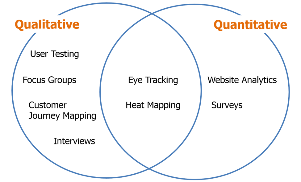
According to Goldman and Lind, leveraging a combination of qualitative and quantitative usability research is essential to building a website that meets the needs of your community. This can include looking at website analytics and heatmap data to identify areas of interest; conducting surveys or community focus groups to solicit feedback directly from citizens; or holding user testing and customer journey mapping sessions to observe how people go about finding information and completing tasks on your website. Insights from such research are instrumental in helping government leaders understand how and why people use their websites so they can optimize the experiences accordingly.

“How” involves looking at which devices – desktop, smartphone, tablet – website visitors use to access content, as well as other key benchmarks like what the most common sources of traffic are. With nearly 50% of all government website visitors coming from a mobile device, it’s particularly important to understand mobile users’ experiences and ensure website content and design are optimized for them.
Research on “why” takes a deeper, critical, look at the reasons why people visit government websites to reveal what information and services are most important to them – what pages are most visited, what services are most requested, what information is most commonly searched for. After all, people visit government websites to accomplish specific tasks, and they want to do so quickly and easily.
So, what are the most common reasons people visit government websites?
Goldman and Lind shared results from a recent Granicus study of nearly 100 city and county websites where we sought to answer this important question, and more – and the results were enlightening. For a complete analysis, download the city and county reports, and read on for a quick summary of insights.
Research revealed that the most popular government website tasks differ based on a number of factors, including whether the website visitor is using a desktop or mobile device. As expected, tasks that require more time or involve uploading/downloading documents are typically completed on a desktop. For example, a long task like paying property taxes on a county website was significantly more common on a desktop at 19% compared to a smartphone at only 12%.
On-the-go tasks like looking up contact information or completing a quick transaction, are often performed on a mobile device. For instance, mobile visitors to a city website were more than twice as likely to seek information about parks and recreation than desktop users, at 32% and 15% respectively.
To enhance experience for mobile users, consider building a customized mobile homepage display that emulates an app and features mobile-specific tasks. And for pages that get a lot of traffic from mobile devices, consider a custom mobile view optimized to meet the unique needs of mobile users.
Several top tasks were unique to specific devices. For example, city website tasks like paying parking tickets and contacting animal services were only performed on a smartphone, while applying for business licenses and finding bids were desktop-only tasks. On county websites, looking up emergency information was a unique task among smartphone users, whereas applying for building permits was only seen among desktop users.
Some top city website tasks differed significantly compared to top county website tasks – and not only because these agencies offer different types of services. For example, accessing GIS map information was one of the top three tasks on county websites, but didn’t even make the top 20 for cities, despite the fact that city websites often feature GIS information as well. Such differences suggest that visitors to city and county websites are seeking different types of information and services. Regardless of their differences, several top tasks were also shared among city and county websites, including jobs, parks and recreation, online payments, and tasks with the courts.
While our top tasks research is a great starting place for any agency seeking to understand what people are most commonly trying to accomplish on local government websites, there’s no magic formula that works for everyone every time. After all, each agency and community are exceptionally diverse, with unique digital expectations. That’s why it’s imperative to do your own research to understand your audience and build a website designed to meet their needs. Here’s a recap of best practices to consider as you set out to transform your website into a digital service portal:
Watch the webinar recording for more details on how you can use UX research to identify top tasks on your website, and download the whitepapers for a full analysis of top city website tasks and top county website tasks.
Interested in learning more about how to optimize your website to serve and engage your community? Register for our upcoming content bootcamp session on Wednesday, October 24 at 11am PT / 2pm ET. We’re teaming up with Jacqueline Lambiase, a TCU professor who recently evaluated 200 local government websites to measure how well they engage citizens. We’ll share insights from the study, along with actionable tips for overcoming common website engagement challenges. Don’t miss out, reserve your spot today!