In 2021, a government website will need to be mobile-friendly, easy to navigate, and ADA-accessible.
Aside from that, what should it look like?
To help you understand the best government website designs in 2020, we gathered examples of government websites sorted by the high-level goals they serve.
Because a great government website design can help you:
Residents visit government websites to get things done. Go for a service-oriented site if you want to:
Interested in adding services to your website? Explore govService >>
The City of Kansas City, Missouri, wanted to put their website visitors front and center. To do that, their website prioritizes city services while positioning the city as modern and forward-thinking.
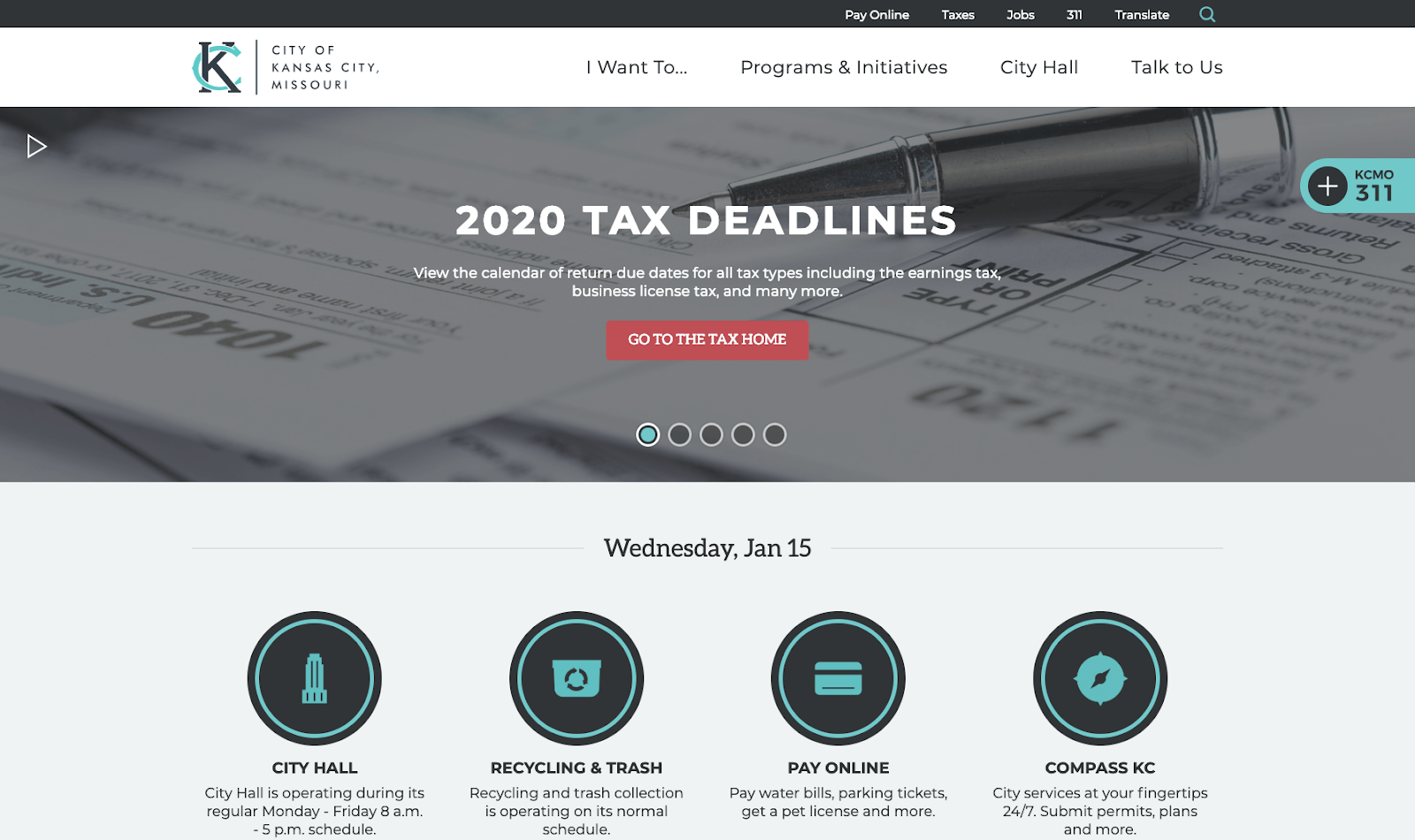
Prioritizing services turns a website into a 24/7 tool for residents and visitors. It’s also a time-saving tool for staff who receive fewer emails and phone calls for basic information and services.
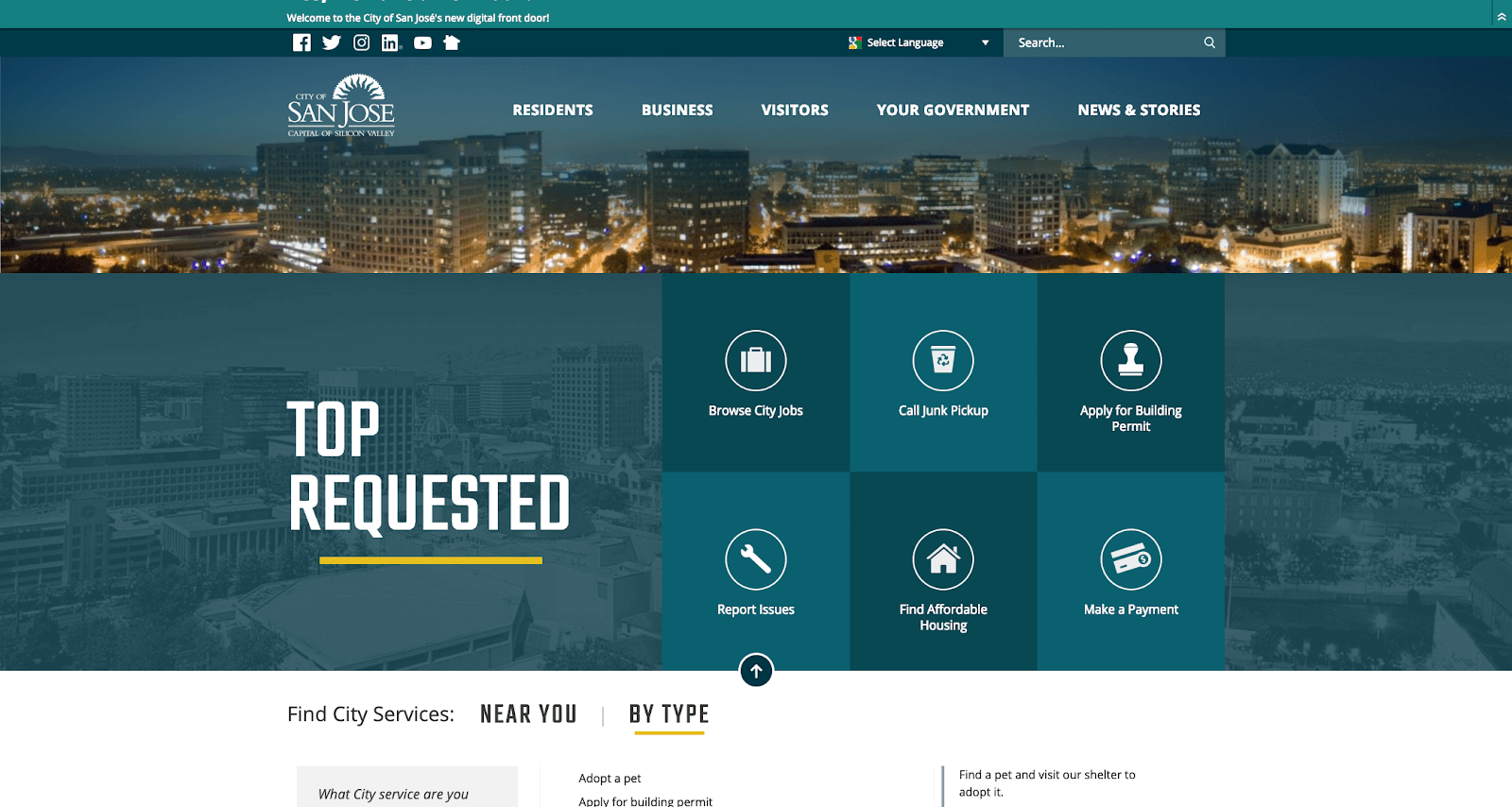
The City of San Jose, California, wanted a website that was both as innovative as the community and as customer-oriented as the city leaders and staff that serves them.
Everyone navigates a website differently. That’s why it’s important to have user testing as part of your website design process — to make sure the website is intuitive to all.
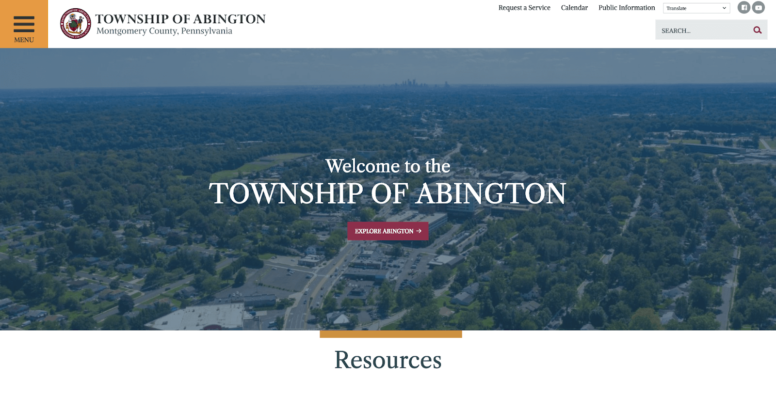
In Abington Township, Pennsylvania, the team wanted to cater to the user experience by focusing on the presentation of services and information.
A hamburger menu condenses the traditional top navigation and can make navigating on a mobile device much easier.
In Amarillo, Texas, the team wanted to turn their website into a digital extension of the service the city provides and make it a place where residents can get things done quickly and easily.
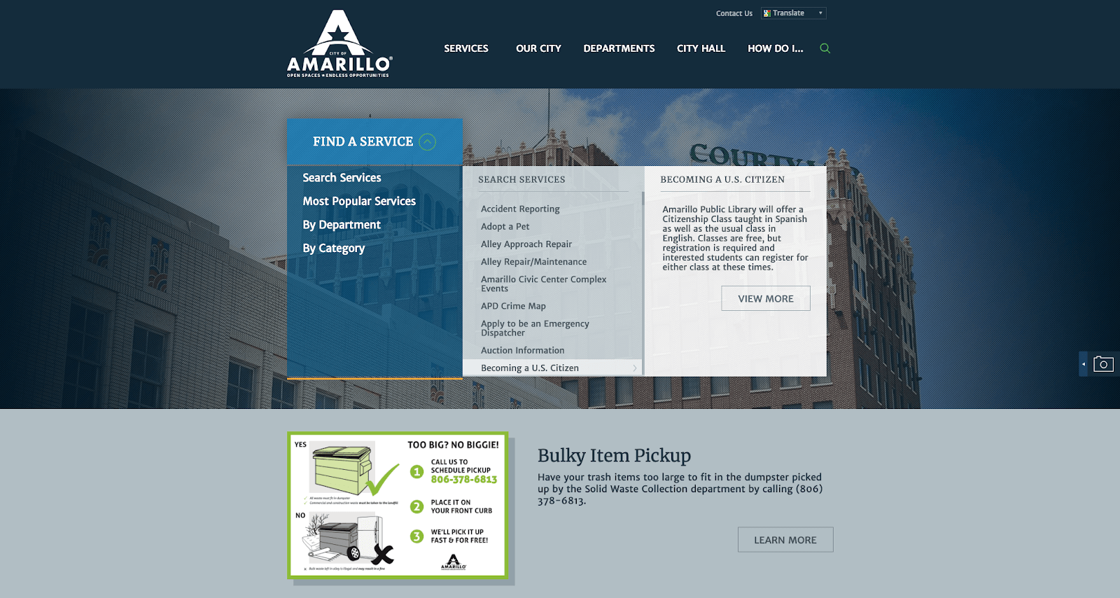
Require too many clicks and residents can get lost, frustrated, and give up. By bringing services quickly to people’s fingertips, like Amarillo does, you can give users a better experience and reduce phone calls and emails.
Not just a consideration for big companies, a professional brand goes a long way in improving the perception of municipal departments and organizations. Concerted branding, always a website consideration, helps you:
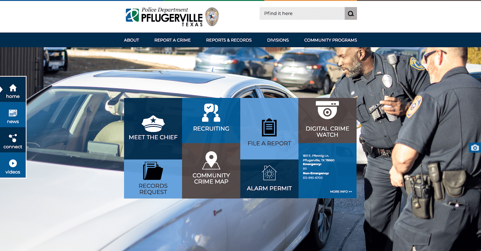
The website for the Pflugerville Police Department in Texas highlights their professional, approachable, and transparent approach to law enforcement.
Gather qualitative feedback to understand people’s attitudes toward your city or department. Even a small focus group, if well-directed, can give you actionable data to drive a difference-making design.
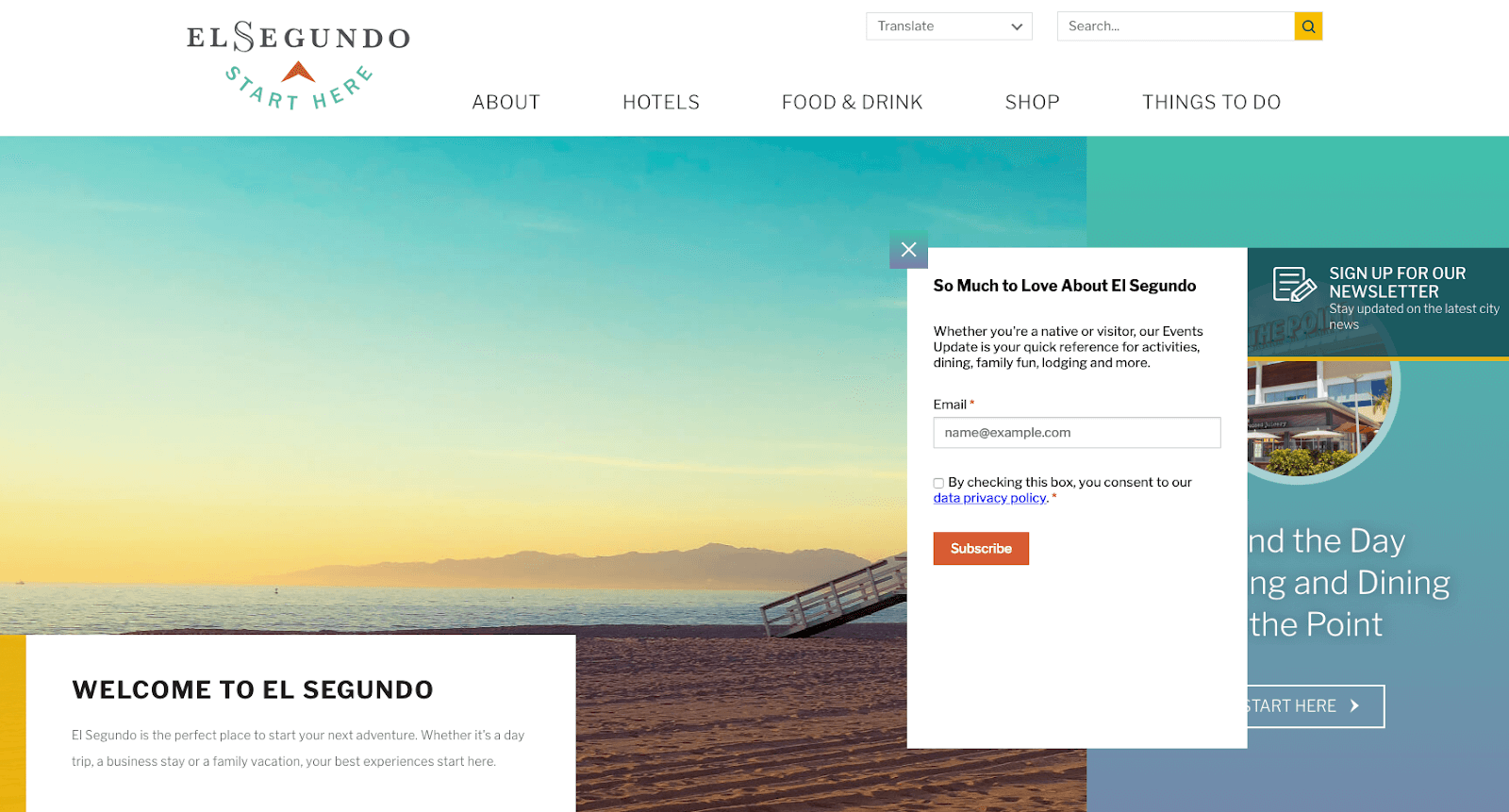
In El Segundo, Calif., the Economic Development organization wants to encourage business growth.
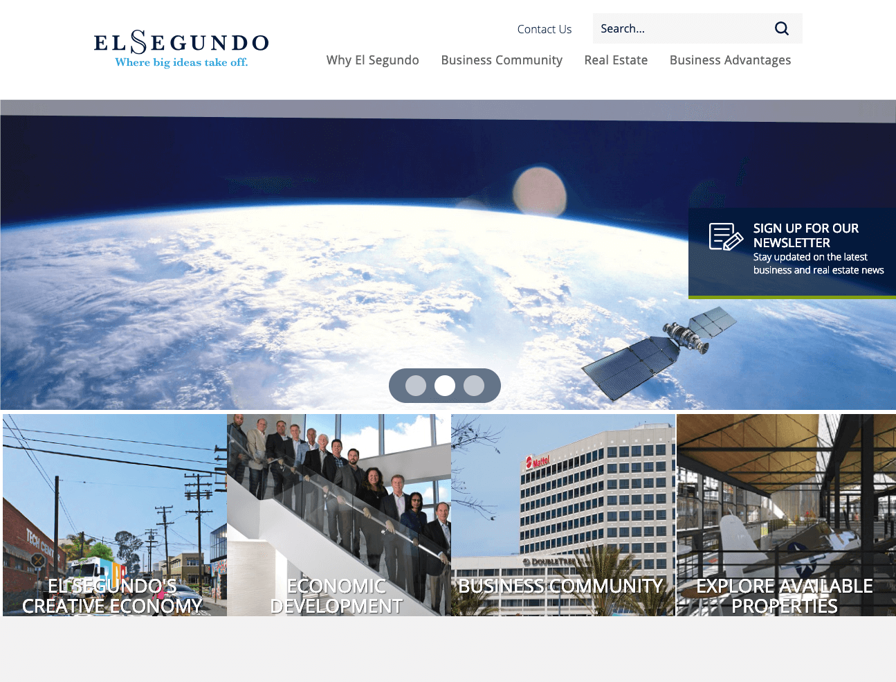
Stock photos are nearly always a second-choice to great original photography. Nearly always. The hero image on this website is stock, but stands out and serves its purpose dutifully.
The City of San Jose Economic Development in California wanted to attract economic development by highlighting San Jose as a desirable place to start a business.
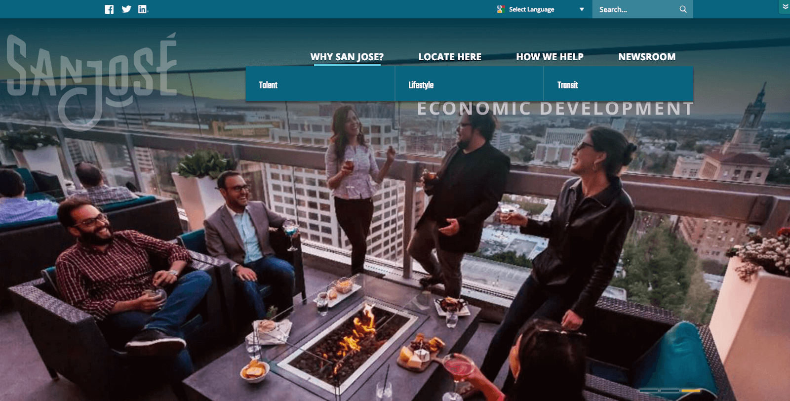
San Jose is proud of its diversity. By offering their website in a variety of languages (see top navigation), they make their website as welcoming as the city itself.
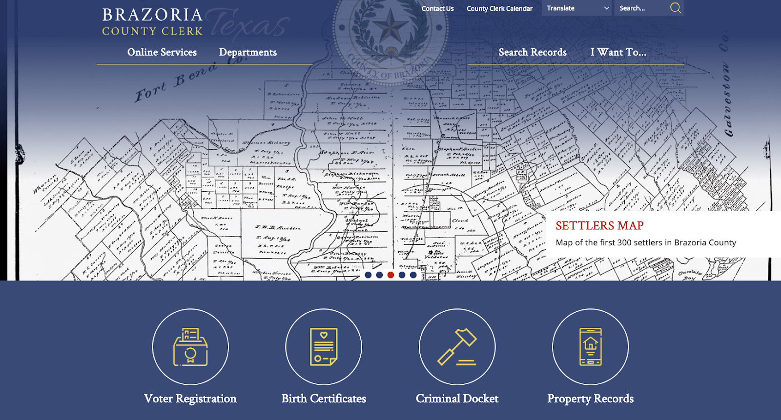
With their website, Brazoria County Clerk wanted an above and beyond website to highlight the above and beyond service they deliver to the community.
Everything in a website design speaks — typography, images, colors. All these elements should combine to reinforce your brand.
When you connect websites to digital communications, you can strengthen connections between government and the citizens you serve. Follow the lead of these websites if you want to:
With their website, El Segundo Hospitality & Tourism positions the friendly community as a great place to spend time — from day trippers to young professionals to families.
Don’t let your audience slip away! Give them a chance to opt-in to your communications. A homepage overlay quickly builds your audience for a newsletter.
Nestled among mountains, the Town of Silverthorne, Colo., is a popular destination to live, work, and play. Their website offers an engaging destination for visitors and residents alike.
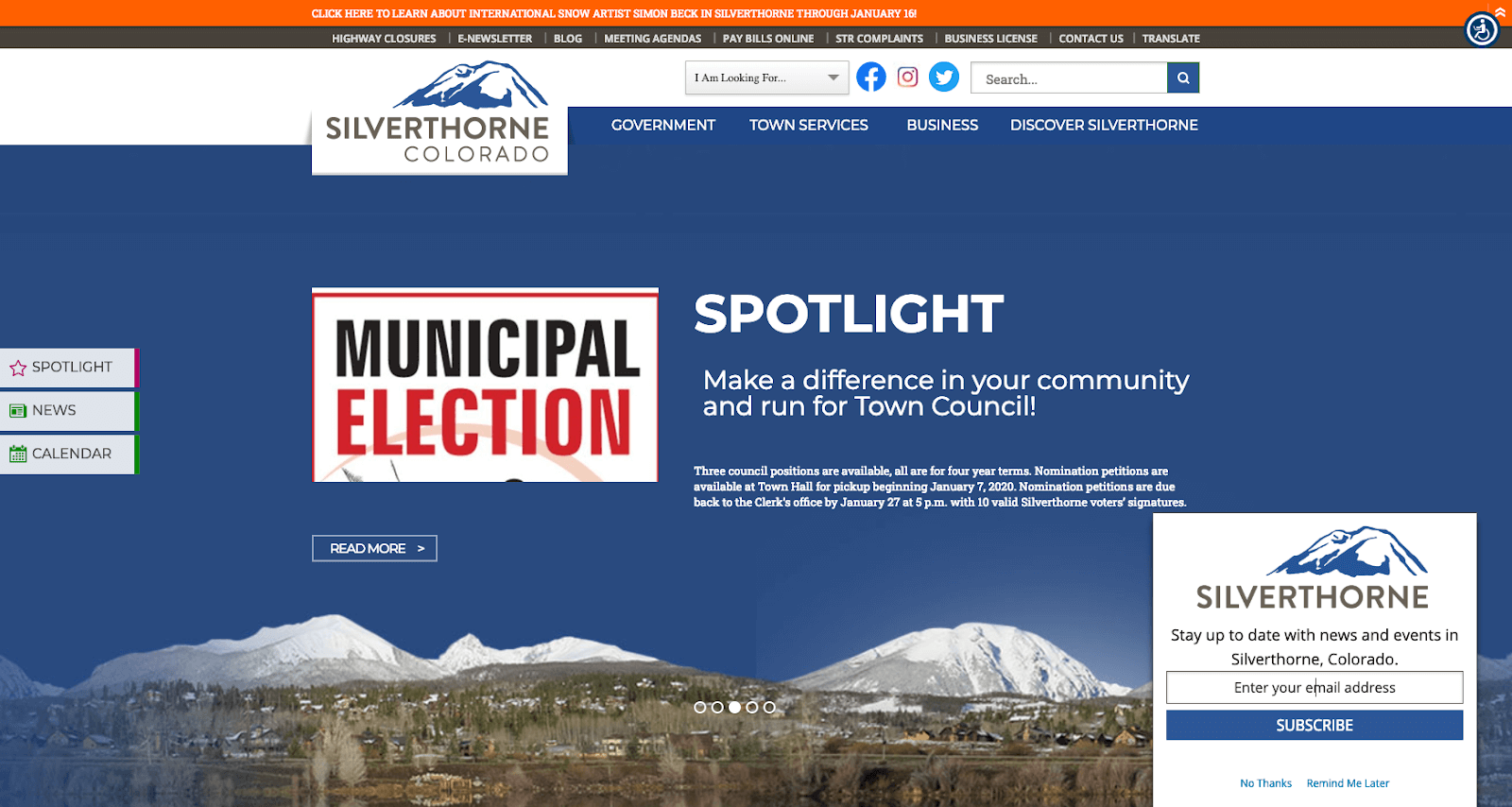
The homepage content on this website changes constantly. It highlights all the exciting opportunities in the city, while giving residents and visitors reason to check back.
With their website, the City of Merced, Arizona, empowers their community by offering many opportunities to stay informed, take action, and make a difference.
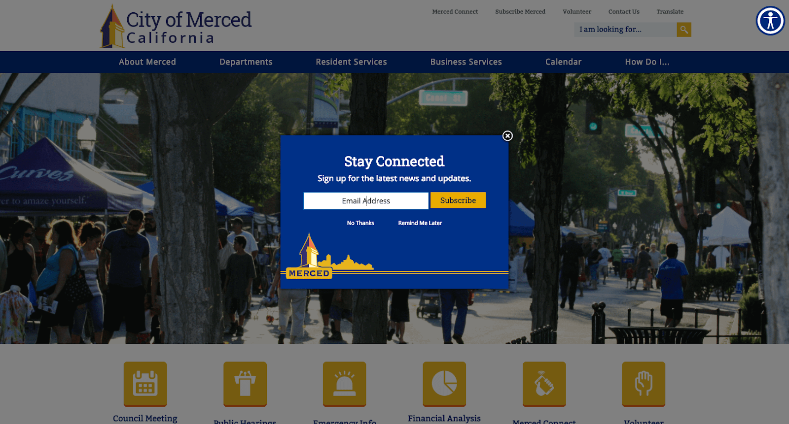
Email subscription overlays can appear right away or when a visitor is leaving the page. Test it to see what works best for your community.
Sometimes you need a website or microsite to serve a unique goal. From custom websites for emergency response to municipal airports to zoos, here are some standout examples.
Dallas Love Field Airport, a municipal airport in Dallas, Texas, wants their guests to feel they can move through their website as easily as their airport.
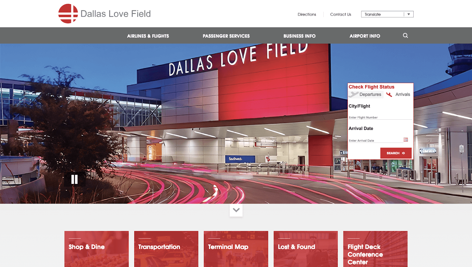
Airports can be frustrating. Dallas Love Field Airport removes that fear by making airport navigation as easy as possible for visitors. They take what is most important to their users and put it first.
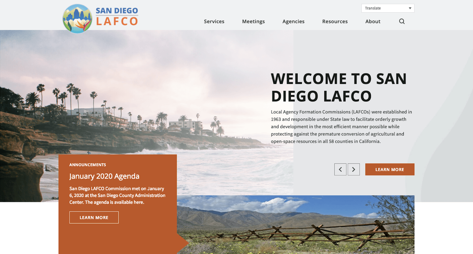
The San Diego Local Agency Formation Commission illuminate the relationship between government services and the community’s needs.
Take Me There
By alternating sections of bold and clean backgrounds, LAFCO’s website doesn’t overwhelm the user. It uses small techniques that facilitate readability and navigation.
The website for Montgomery Zoo in Montgomery, Alabama, is designed to attract visitors, reduce phone calls, and showcase news.
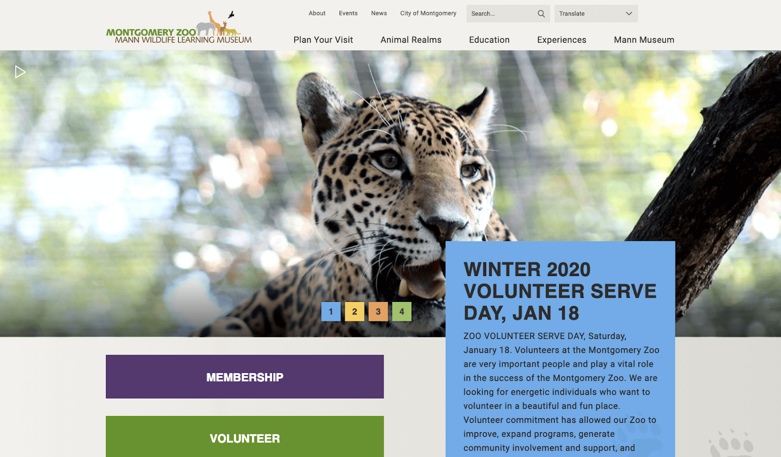
Montgomery Zoo makes navigation accessible, even at the bottom of the page, with a sticky menu bar.
Kilauea Volcano has been continuously erupting for decades. In 2018, an eruption wiped out more than 700 homes on the Big Island. With their specialty site, Hawaii County provides timely information to residents, media, and other stakeholders.
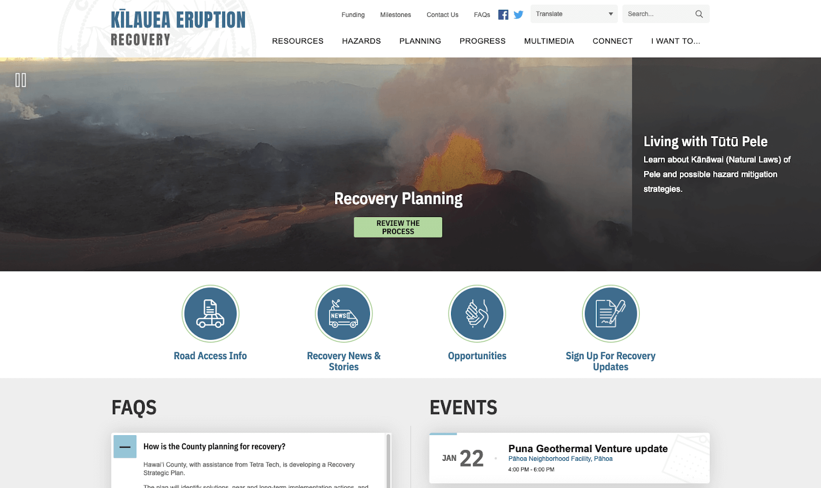
By keeping the site simple, clean, and easy to navigate, users will not be distracted in their search for important information.