Website trends come and go, but some old-school best practices linger well past their expiration. This week, we examine the common myth that the homepage is the most important page on a website.
It has long been argued by usability experts that the homepage is the most valuable real estate of your website. It’s the page that welcomes visitors the first time they visit your site, and because of this, many web designers focus a lot of their time and efforts on the homepage design.
Increasingly, website traffic comes from search engines and social media. The idea of a website’s homepage as the entryway into a site’s content is becoming obsolete. Users’ browsing and searching behavior have changed significantly in the last few years with the widespread use of apps, social media and mobile devices.
Users go to websites with a goal already in mind – to find the information they need or want. This is especially true on a government website – where transactions and information requests are the most popular. This led many to believe that as much information as possible should be placed on the homepage in order to lead visitors to what they seek.
The truth is people want and expect quick answers. Nowadays, they’re using search, social and referrals to find content on a specific page deep within your site – not your homepage. If they’re unable to find what they need, you’ve lost them.

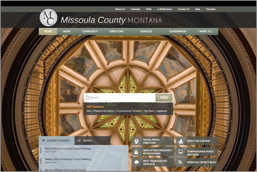
The Missoula County, Montana website features a search-centric homepage, allowing visitors to easily and quickly type in what they’re seeking.
In our last website myths post, we explored how users read on the web and discovered that they generally prefer to scan the page rather than read it word-for-word. The homepage should act as more of a guide than a bulletin board. It should contain the most frequently searched for items and services to make it easier for residents to find what they need.
UX expert, Jared Spool, provides a great example for comparison. Think of your website as a hotel. Your homepage is like the lobby, which is a great area to get more information, ask questions and explore what else you have to offer. However, the most important place in a hotel is not the lobby. It’s the room. People don’t visit a hotel to check out the lobby – they go there to stay in a room. Similarly, people don’t visit a website just to look at the homepage. They go to the site to find out more information about what they need on a specific page. If they’re unable to find what they’re looking for, frustrations can arise.
The City of Rancho Cordova, CA has a clean and uncluttered homepage that prominently features the most requested services, allowing residents to access what they need to complete their goals. Furthermore, if a visitor can’t find what they’re seeking from the Services menu or buttons, the large search bar is another alternative.
Your homepage should be a Launchpad from which site visitors can go to the page that will present the information they need, want and seek. Before you begin designing the homepage, think about the following: