Website trends come and go, but some old-school best practices endure well past their expiration and age just as well as cheap wine. Our website myth busting series helps agencies find a better path to website usability and relegate outmoded myths to the rubbish heap of history. This week, we take on the myth that people read word-by-word on the web.
People go to websites with a goal already in mind – to find the information they need or want. Because of this, it’s common to think that a website should be filled with as much information as possible to allow users to find exactly what they seek. From this, the age of the digital file cabinet for municipal websites was born.
Although many people turn to the web to find information, they don’t necessarily read everything on a web page, especially if they need to complete a task – like pay a utility bill or look up permit information. Unless they’re really interested in the content, they’ll usually skim the page to look for keywords, meaningful headings or scannable lists. If they’re in a hurry, people will often skip over any information that’s irrelevant to them.
The Nielsen Norman Group conducted a study to see how people read on the Web. The Group found that users generally prefer to scan the page rather than read it word-for-word because they are looking for a specific piece of information. They don’t want to read through an entire page just to find it.
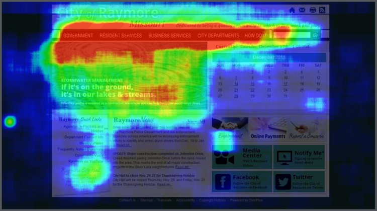
Furthermore, eye-tracking studies have found that most people read online content in an “F” pattern. This shows that people generally scan horizontally across the first paragraph or menu to see if the information they need is listed here. They’ll try again by moving down to the next section and scan horizontally again. Finally, they’ll look to the left-side of the content and scan this in a vertical manner.
The City of Raymore, MO took a user experience (UX) driven approach to their website development and found that people were looking at the main navigation menus to figure out where they can go to access the information they need. Furthermore, the paragraphs toward the bottom of the page were skipped entirely.

If a user is not able to easily and quickly find the information they seek, they may become frustrated and leave the website. Structure and write your content to make it easy for them to find what they need by:
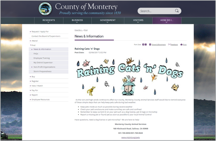
Monterey County, CA created a fun, informative news item that was short yet to the point. Bullets and bolded text calls out key information that readers can quickly grasp while scanning the page.

Following content strategy best practices will allow you to design great experiences for your visitors. Before you start making every piece of information available on your website, think strategically about your content across all departments. Make sure your content answers the following questions:
Download our content strategy checklist to help ensure your content is clear, concise and understandable.