
Website trends come and go, but some old-school best practices endure well past their expiration dates, and age just about as well as your middle school mullet. Our website myths series helps agencies find a better path to website usability, and relegate outmoded myths to the rubbish heap of history. This week, we explore website navigation strategies and whether creating multiple paths to information is a good idea.
I’ve always been particularly perplexed by the origins of this week’s myth. It holds that creating multiple paths in your website’s navigation to individual pages is confusing and undermines usability by creating long menus and a complex sitemap. In my opinion, though, just because an approach has the potential of being poorly implemented doesn’t make it inherently wrong.
As a general usability principle, it’s a good idea to provide openness and flexibility to users, providing multiple entry points rather than restricting them to use a single route to a destination that they may not know, have forgotten, or is just inconsistent with their way of thinking.
The typical government website is comprised of hundreds, if not thousands, of pages of content and information. Thinking through the most common ways residents will think about finding information will only help facilitate successful navigation of the site.
Hoa Loranger explains that “When it comes to navigation, following user expectations usually results in better outcomes”.
If you think about users visiting a typical government website, there will be some who know exactly what department provides the service they need while others will only know the task they need to complete. Developing two navigation paths by placing common links where they fit from a department standpoint – such as “Utilities” – as well as a task perspective – such as “I want to…” makes perfect sense because these are logical places users may look to for information.
Granicus’ research confirms the validity of the multi-path approach. Each website redesign process starts with an extensive User Experience (UX) Analysis to uncover who the site visitors are, what information they seek and how they prefer to access it. This process has repeatedly confirmed that residents use a variety of methods to find key information on the site.
Consider this example from the City of Raymore, Missouri. Homepage buttons were created to provide one-click access to frequently accessed items, like Pay Utility Bill, Parks & Recreation and Employment Opportunities. But, because some users exclusively used the top navigation, links to “Jobs” and “Online Payments” were also included in the top navigation of the homepage.
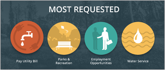
The City of Raymore includes the same links to jobs and online payments as they do in the “Most Requested” section of the homepage, making it easier for residents to get to these frequently-requested items.
After extensive usability testing, we demonstrated to the City of Caldwell, Idaho that not all residents think alike when it comes to searching for information on a website. The study found that users were drawn to the main navigation and images on the homepage, illustrating two different paths to get to the same destination. Taking the results from Grancus’ usability tests, an “I Want To…” menu was created to address common requests – such as Apply for a Job, Make a Payment, and Get a Permit. The same requests were translated into homepage buttons, making it even easier for visitors to find exactly what they’re seeking.
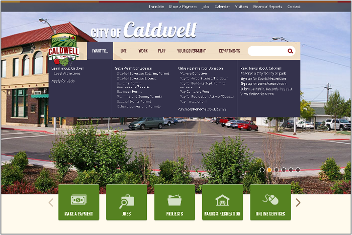
The City of Caldwell includes the same links found on their homepage buttons as they do in the “I Want To…” menu, tackling two common paths residents use to find City information.
Often times, a web page might be relevant in more than one category. For example, we helped the City of Kent, Washington understand that paying for utility bills is a common task for residents. But because this task can also be searched for as an online service, it made sense to display the utility payment link accessible in two relevant places.
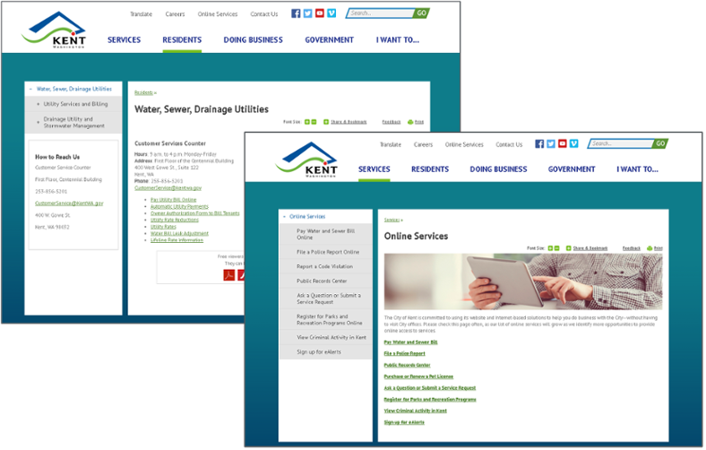
The City of Kent placed the same link on two separate, but relevant, pages of its site, making the utility payment page logically accessible under different categories of the site.
Providing multiple paths to the same destination on webpages can help users quickly find what they’re looking for no matter what their preference is for locating information. However, there will be a point of diminishing returns with putting too many different links on a webpage. You have to be strategic in developing your navigation by identifying the most frequently accessed tasks and focusing on the primary navigation paths for that information. To validate your assumptions, you should ask people who aren’t familiar with your website to complete the tasks and review their navigation paths. If they use the paths you created, you can be assured your website is achieving its mission to intuitively provide information to all users in your community.
For additional guidance, check out our UX Process or read our eBook about Content Strategy, UX and User Interface Design.