We spend a lot of time dedicated to improving our digital messages by focusing on tactics like increasing the use of relatable imagery or adding colorful calls to action. These tips for enhancing our digital messages are important, and can make a big difference to improving metrics like click rates.
But let’s not forget about the power behind the marketing staple of plain text emails.
With all of the HTML capabilities we have to enhance our digital messages, it may seem old school to focus on emails that only include text. But don’t underestimate them – plain text emails can avoid SPAM filters better than HTML-only emails and are accessible for all users. Plus, some agencies require that digital messages are sent in plain text format.
So how can you ensure that your plain text emails are making an impact? Here are a few tips:
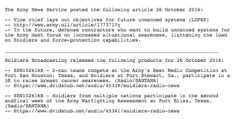
While the same is true for all emails, formatting is extra important for plain text emails. With limitations on bolding, font size and color use, try using indicators like a double asterisk (**) next to your headlines to make them pop, use a page break line to separate content by section and bullet your content by lines. This will help your reader easily scan your message by section. Here is an example from the U.S. Army Service:

Another key for your reader’s ability to scan is whitespace, which helps to break up content and drive your reader to the key portions of your plain text email. Whitespace can provide a clear eye path to clickable links, headlines or calls to action. With emails that have virtually no white space, they can be difficult to read and follow along.
As with any emails (including HTML) too many links is a recipe for overwhelming your reader. This is especially true for links that go unlabeled, which will drastically reduce the click rates for links when your reader doesn’t know where they’re headed. While there are no firm rules for how links are too many, it’s better to have a “less is more” approach in plain text emails.
While it may be more challenging to call out your Call to Action (CTA) in a plain text email, there are still a few options for ensuring your audience’s eyes are drawn to where they should click. The double arrow brackets (>>) can help draw attention to where your reader should click. You can also try using brackets. Here is an example:
A great rule of thumb when it comes to plain text emails is “the simpler, the better.” Try only including information that is absolutely necessary in your plain text emails, call them out using symbols and try testing what works best. Just because it’s plain text doesn’t mean you can’t try A/B testing and tracking what tactics are increasing your open and click rates.
Want to see how your digital metrics are compared to your peers? Check out the latest GovDelivery Benchmark Report: Improving Metrics that Matter.