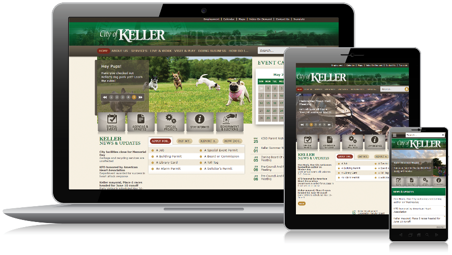
Rachel Reynolds, Public Information Officer for the City of Keller, knew that over half the audience for the city’s website were accessing the site on their mobile devices. This edition of Digital Expert’s Corner explores Rachel’s thoughts about mobile responsive website design.
Why is responsive design so important to the city?
It was the driver for the last website redesign. A solid half of our traffic is coming from mobile devices and we knew that our old site didn’t give the resident a good experience. It was worrisome to know that while residents were engaging with us on social media, every time we posted a link, the resident was encountering a non-responsive design, leaving them to pinch, zoom, move, flick and try to read small font. Not a great experience.
The web update was also a reaction to the evolution in technology and resident expectations. Our residents are pretty cutting edge (active, educated, upper-middle-class), we feel a lot of pressure to keep up with that growth. We engage deeply with our community on social, and the bulk of social engagement occurs through mobile channels. It was both enhanced social engagement coupled with the website analytics that told us we needed to step up our game.

What are the most important components of municipal website design?
First and foremost a city website needs to allow the resident or employee to easily find what they are looking for. I’ve spent some time on municipal websites where I couldn’t find anything, and I’ve felt for the resident or visitors. With my background, if I have issues locating content on a city site, it’s just a tragedy.
Other than being informational, I think a municipal site needs to give some sense of the city. It could be the color or the photos or other design features. My favorite city sites give you a peek into the community. Are they laid-back? Uptight? Formal or informal? Keller is very fun and family friendly, and I think that the website reads that way. I live in a nearby municipality, and while their site is informational, it is bland. However, it is a large city, and I realize they are trying to be a lot of things to a lot of people.
How does the city approach content creation?
Our web content contribution is decentralized, but as PIO, I serve as a check and balance. There is staff in each department who are responsible for updating their pages. However, there are departments that work hand-in-hand with me to keep their content readable, check links, etc. I do sign off on all page updates. I also work with departments on large-scale projects, like if they want to reorder their content.
There’s no documented, formal content strategy. However, we talk a lot as a group about using simple language, ease-of-use, figuring out ways to streamline information. A user should be able to discover the basics of what they need without opening ten PDFs. Information should be easy to locate and easy to understand.
How do you hold yourself accountable to the “simple and easy” metric?
We scan Google Analytics (GA) pretty regularly. Our departments always have a side competition about whose pages are getting the most views. We use GA to determine if our residents are accessing content that is prominently featured. On the flip side, we also use GA to determine what content isn’t popular. Maybe the content is outdated, or not an important topic anymore. OR, conversely, the information is very important, but the resident just can’t find it. There have been times when we’ve done some handwringing over an important piece of content, so we’ll make adjustments to ensure it performs well.
Have you unearthed any surprises in Google Analytics?
Not really. We have a pretty good idea of what our residents are interested in. Our community is a lot about “quality of life” so it’s no surprise that parks and rec, the aquatic center and the library are always competing for top views. After that, it’s jobs and police. We are one of the safest communities in Texas, so we push out a lot of our crime statistics on the police pages.
How do you use the “How Do I…..” section?
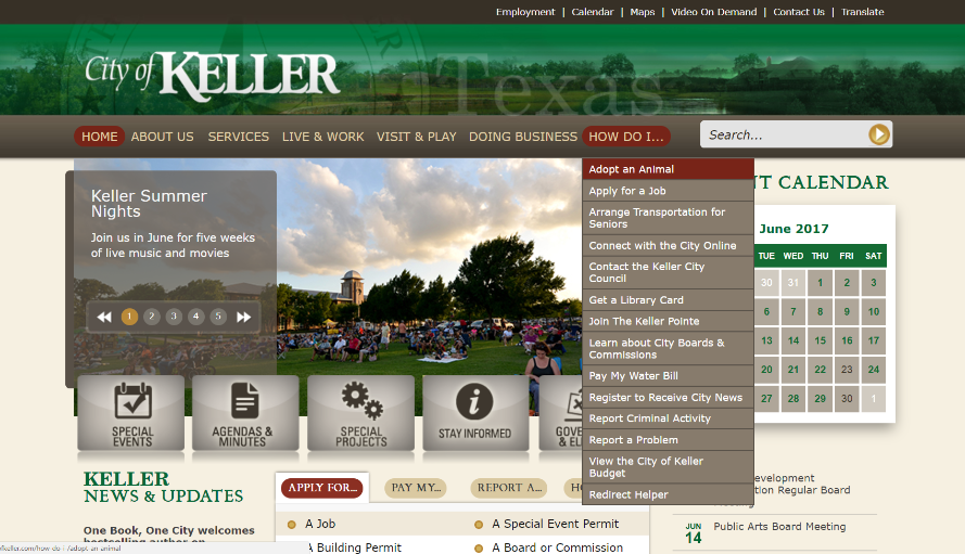
GA’s “in page” feature shows us that section is extremely popular. We switch this menu out a few times a year. During election season, for example, we’ll push registrations there. We also include items that as a basic function, people just look for a lot, like animal adoptions.

How do you ensure continuous improvement?
The website is a living, breathing entity. We communicate and meet regularly with all the departments. Recently, we formed a group called the “Comm Squad” that consists of the folks who handle the communications functions for the department. We meet monthly, so there’s an opportunity to talk about the site and social media.
Apart from the monthly meetings, I’ve been cycling through the departments to take a second look at streamlining their pages and make it easier for mobile users. We’ve been transitioning departmental page styles to feature big buttons. Those are a godsend if you are on a mobile device. Plus, those buttons give us an opportunity to feature fun photos and get the resident where they are going faster.
Over time, when you have decentralized content contribution, you end up adding more pages. The content contributors don’t go back and think through the process from the beginning; they just add material. The additional material can be unwieldy, repetitive and difficult to navigate. I’ve been using GA and working with the departments to establish a methodology to reassess pages after adding content. We also add the folks who answer the phones into the mix. They know what they are getting the most questions about. We comb through the department section and produce a page by page detailed recommendations document. Overall, our motto is, “If it’s important, it’s easy to find, and if it’s not important, it’s not on the website.” We collaborate on the document, and when the time comes, I take a few days to build the new pages. The process has worked well so far.
Interested in learning more about responsive design? Check out how Granicus govAccess can help!