Welcome to the third installment of Behind the Envelope, a new series of posts exploring ways for you to get the most from Granicus. To begin the series, we covered the GovDelivery Network and ways to increase your subscribers. Today we’re asking you to put yourself in the shoes of citizens subscribing to your topics.
Click Here to Subscribe

The red envelope. Many of our clients use it as a starting point for citizens to subscribe to topics they offer. But when was the last time you clicked on the icon yourself? If it’s been awhile since you’ve taken yourself through the subscription process, it’s time to do it once again.* Putting yourself in the shoes of a citizen subscribing for the first time is something you should do on a regular basis. It’s a good exercise to double check things.
*If you have already subscribed to your account with your work email address, make sure to use a secondary email address. Using an address already subscribed to your account will skip the following process and take you directly to your current subscriptions.
Let’s look at four things you’ll notice during the subscription process.
1. Banner Image
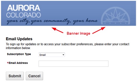
Located at the top of each subscription page, the banner image provides some branding at the beginning of the process. If you’re happy with the banner image you have, no worries, but did you know you can switch it out? We see clients changing the banner as a special initiative or celebration is being promoted or quarterly with seasonal designs. If your banner image features a public official’s name or picture, make sure to update it after a change in leadership or a new headshot is available.
2. Categories and Topics
Categories and topics are the information you provide for subscriptions and the way it’s structured for your citizens to view.

Reviewing your categories and topics is a chance to see if you are offering information that’s no longer relevant or needs to be reorganized. It’s also time to make sure you don’t have topics that should be unlisted and unavailable for subscription. Internal lists, such as a newsletter for employees, seems to be the biggest culprit we see most often.
Is it clear what your topics are about?
See those blue circles with the “i” in them? Those are topics that have added a description. When a subscriber hovers their mouse over the circle, additional information appears. Why would you use a description? Simple. Topics like “newsletter” or “press releases” are self-explanatory, but if the topic is related to a new initiative or is using an acronym, it’s probably best to add a description. It’s always good to remind yourself that you’re around this information every day. You think about these efforts, go to meetings about these efforts and care deeply about them. Citizens subscribing to your topics don’t have that same familiarity. If they don’t know what it’s about, they won’t subscribe. The best descriptions we see have to do with content or frequency of updates. Let’s look at how Raleigh, NC did just that is these two examples:

A citizen might think their Special Events, Road Races and Parades topic is promotional in nature. Instead, citizens know it will inform them of road closures.

Citizens subscribing to Affordable Housing can expect updates 4-6 times a year.
Offering a lot of topics?
If you have many categories and topics, and feel like your list is getting a bit too long for citizens to scroll through, consider collapsing some of your categories to make the list more visually appealing. Using this abbreviated example:
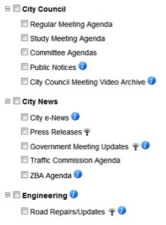
If I thought the amount of information was too much for people to scroll through, I could collapse the City Council and Engineering categories, ultimately featuring the City News category and its topics more prominently:
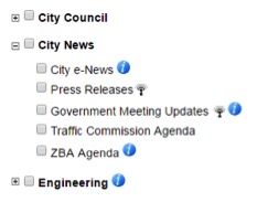
3. Questions
Are you gathering additional information from citizens when they subscribe? Asking questions is an option available to you. Questions can be account wide or topic specific. For example, a city might ask every subscriber what zip code they live in…
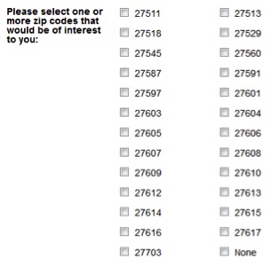
… while a parks and rec department ask about favorite activities.

A note about using questions. If you’re already asking questions, check to see if administrators are actually using that data to personalize information. If not, then stop asking questions. There’s no need to collect information you’ll never use.
4. Don’t forget about the GovDelivery Network.
We’ve covered what the subscription process looks like when a citizen begins subscribing at your website, but don’t forget about the GovDelivery Network and how it drives subscriptions. Citizens subscribing to your information via a network page have a different experience. Citizens will see your agency among multiple agencies on the network page. Your agency will be represented by two things, your network icon and a limited amount of topics.
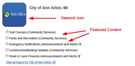
The limited amount of topics on the network page is called Featured Content. Many agencies choose to highlight their most popular topics like newsletters or press releases, but those getting the most from this option rotate their featured topics. Think of a health agency featuring their influenza topic in the fall when we’re all hearing about getting our annual flu shot, or a cold weather city featuring their snow emergency topic during the winter months. Thinking it makes sense to rotate the topics that get featured? Great.
It’s easy to get caught up in our day-to-day responsibilities and forget there are citizens coming to your website for the first time, each and every day. Taking time to review the process and make sure things look good will provide the community you serve a better experience.