What was the last product you bought? Now think about how often you see advertisements from this brand. If they are effectively promoting their brand, it should be pretty often. The same principle applies to local governments who are trying to promote their new latest investment in resident engagement.
Your new mobile application, designed to increase efficiency and improve resident engagement, will struggle to succeed if the population is unaware of it. This means it is critical to promote your application across your organization and community early and often.
Whether promoting through a direct link to download the app on the city website or a promotional image, this advertising effort should draw in residents and show them what the product has to offer. An effective advertisement should also include a strong call to action and visually pleasing elements that help it stand out. Once you have acquired the attention of your community, be sure to show them what the new functionality offers them.
At Granicus, we understand that promoting your application can be a daunting task, which is why we are providing 5 Ideas to Promote Your City App.

One of the most effective ways to advertise your city’s new mobile application is through a promotional spread. Adding a spread to your website helps show constituents what your application provides, how it looks, and how it works.
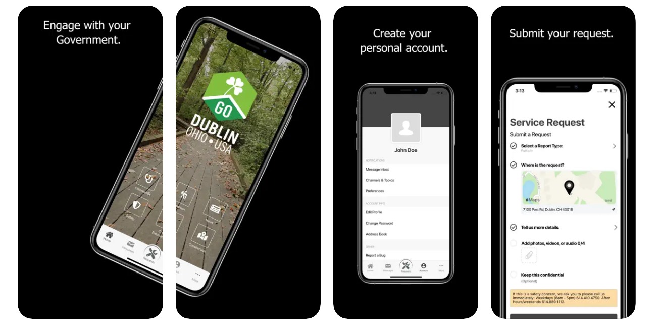
This spread by Dublin, Ohio is a great example because it is simple, realistic, and educational. It shows the application home page, how to create an account, and then how to submit a request. A simple design like this can catch the attention of residents who visit your website and lead to more application downloads.
If your city has multiple announcements to make, it can often be difficult to prioritize promotions. Scrolling billboards are a great way to eliminate this problem while also providing easy access to each announcement. Although it may sound complicated, this approach is simply an advertisement that scrolls at the top of your organization’s website.
Scrolling billboards should automatically switch through a selection of different advertisements and also allow viewers to manually scroll to a specific promotion. This not only catches the eye of website visitors, but it also relays the most important announcements in a more accessible way.
The picture below is an excellent example from Helena, Montana’s website. It stands out on the homepage and provides a link that lets the viewer visit the page. The App Store and Google Play are also visible in the top left corner to show people where they can download the app.
One of the most important parts of an advertisement is getting the viewer to take action. Providing a direct link is a great way to do this because it allows the viewer to download the app with the click of a button. Direct links are both simple and easy to use. Just add a URL to a button or a picture that users can click on to download.
Surprise, Arizona posted this direct link on the homepage of their website. When clicked on, the link takes the viewer to a page that allows them to download the My Surprise mobile app, learn more about it, and even submit a request. They attach the link that they use to the entire advertisement so that viewers can click anywhere on it to learn more.
When website space is limited, it is sometimes easier to use a smaller version of a larger image, which is known as a thumbnail. These smaller images do not stand out as much as promotional spreads or scrolling billboards, but they still provide website visitors with easy access to more information.
Use this link to view an informational page that Mesquite, Texas linked to one of their thumbnails. When users click on the thumbnail, they go to this page that provides a mockup, an informational video, and a link to download the mobile application.
The mockup displays what the app will look like on an iPhone, the video shows how to submit a service request, and the link allows viewers to download the new application on their preferred platform.
Many municipalities and cities already have dropdown tabs within the header of their website. Although this method provides access to information, it can often be difficult to locate and fail to capture the viewer’s attention. As a result, it is more effective to create a scrolling summary that provides a more visual representation.
Scrolling summaries are like billboard promotions that were discussed earlier, except they also contain a small summary of the page so that people know more about the link before they click it.
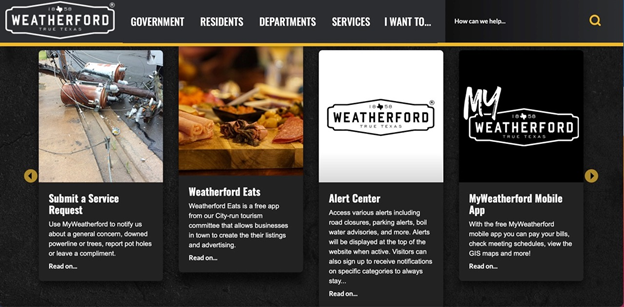
Weatherford, Texas did a good job of this in its announcements section. After scrolling halfway down their website, there is a scrolling panel that displays all of their most recent announcements. Each one of them has a small photo and a short description that summarizes the information. If visitors wish to view more announcements, they can also click the arrows to scroll in either direction.

Bonus: Expand awareness through your call center
Even after advertising your new mobile application, it is possible that some people have not heard of it. Advertising through your 311 call center is a great way to continue to spread awareness. Simply add a section to the call center script that encourages callers to download the city app to submit requests.
To ensure that callers know how to download the app, it would also be beneficial to provide a link within the follow-up email. This link should direct the recipients to an informational page where they can then download the app or learn more about it.