What purpose does the website serve for the city?
Tustin: This website is for the residents to find out what is happening in the city. It’s a one-stop-shop to help guide users to discover La Quinta. It’s a communications platform but it can’t do everything. I think building a site to be an end-all-be-all is impossible. Our old site tried to do that and ended up with a difficult-to-navigate 4,000 pages of content. After the analysis conducted by Granicus at the beginning of the project, we started watching the analytics and discovered users couldn’t find what they were looking for. So, for this version, we culled about 90% of the pages.
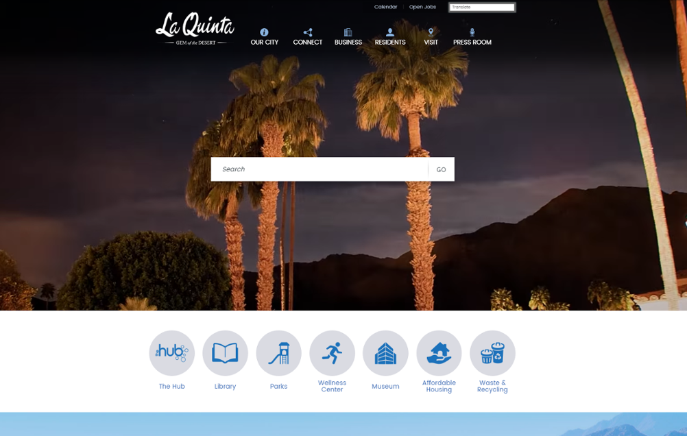
Marcie: As a destination city, the site services both residents and visitors. We also get a lot of traffic from festival-goers, for example visitors from Coachella, looking for places to stay. Resident survey comments and phone calls made us realize that it’s really important to give the user what they were looking for immediately, that’s why we have the search-box-centric homepage.
The video on your homepage is very impactful. Why did you decide to go that direction? How does it relate to the city’s brand?
Tustin: We mentioned previously that our demographics are changing. Our traditional demographic was more or less senior citizens who play golf or snowbirds. The old site serviced their needs. Our new demographic, however, are young, millennial families who are year ‘round residents. This demo is “born-digital” and has high expectations of web and social communications. They look to the city site for information on family activities. That’s why we hired the videographer to showcase things to do in the city. He used stop motion to give it that edgy effect. I should also add that our Granicus designer, just “got us” so that certainly helped, too.
Marcie: The new site (and the video style) is meant to brand La Quinta as a city of innovative, trend- setters. Accordingly, we developed our website to be clean, simple and easy to maneuver. For inspiration, we looked at other destination city websites like Austin. In tandem with the website, we revved up our use social media as millennials are responsive to it. We are really excited as we see this new demographic is driving new business to the city. For example, a Montage resort is opening this year.
The video concept was something that we had already been using on our tourism website (playinlaquinta.com) and wanted to bring to the city website. The plan for the City has always been to be a 21st Century City and the use of video on the website helps to move us into that direction. The actual video is a time lapse of some of the “hot spots” of the City if you will and it showcases the vast differences in what La Quinta has to offer. The City’s brand is evolving into a more modern, technological, and exciting catalyst where visitors and the community can really experience La Quinta on a whole new level.
Speaking of innovation, tell me about “the Hub”. It’s an interesting concept.
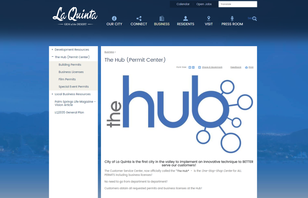
Tustin: This comes out of having a city manager who comes from the private sector who has a lot of out-of-box ideas. He wanted us to have a single place for residents to source any type of permit. The Hub actually has a physical location in the city and now it has a digital one. And it’s working, 80% of our web traffic goes to the Hub.

Have you started planning what’s next?
Tustin: Thematically, it’s all about connection. We’ll continue down the path of digitally connecting residents with the city. We’ve posted our development map! The Hub will get a new update. And we’re looking at ways to connect 3rd party software into our website.
Thanks Tustin and Marcie! Check out our case study to see how four municipalities used their website to improve communications with their communities.


