One in five U.S. citizens has a disability that prevents them from accessing websites effectively, and many struggle to visit local government websites to complete tasks like paying utility bills, applying for permits, or registering for community events. With the latest WCAG 2.0 standards refresh, it’s more important than ever to ensure you have a compliant website and are not inadvertently excluding users with disabilities from accessing your web content.
In our last webinar of the series 18 Minutes to Get You Ready for January 18, 2018, we outlined some of the main ways you can make your website accessible. Please be aware that the following suggestions are not a full coverage of everything you need to do to make your site accessible.
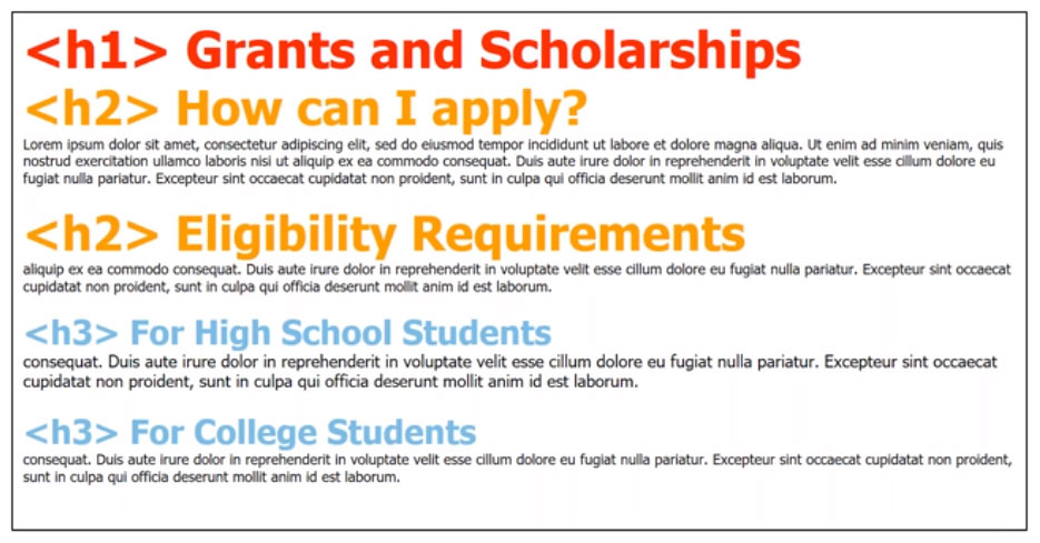
Headings act as the outline of your webpage by providing structure to the content, clearly describe the information that follows it, and allow users (whether they have a disability or not) to navigate the page section by section. Screen readers, specifically, go from heading to heading via keyboard shortcuts – just like how the TAB key goes from link to link.
When structuring headings, it’s important to remember:

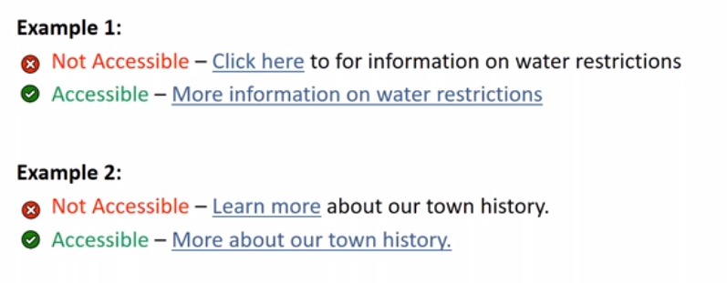
Links are a great way to redirect users to relevant information that’s on another page, website or document. However, it’s essential to use the right words or phrases so that users know where the link will take them. Have you ever come across a link that just tells you to “click here”? While this is obvious for most users, it’s actually difficult for people who use screen readers because they won’t know where “here” is.
When using hyperlinked text, always remember:

Read our recent blog post on Why “Click Here” Links Are Bad to learn why they’re inaccessible.
Images are great for conveying information in a graphical way, but they. However, an image is meaningless to someone who’s blind because screen readers will only look for alternative text (alt text or alt tag). Alt tags are also displayed if an image cannot load properly. Therefore, even if an image doesn’t show on the page, users can still see and get the general idea of what the image is about.
The following points are important to remember when using images on your website along with alt text:

Portable Document Format files (PDF) are usually the biggest risks because the latest Section 508 refresh doesn’t allow for inaccessible scanned documents. In fact, there are not a lot of good reasons to include PDFs on your website because oftentimes, screen readers can’t read the text aloud and users need to print PDF forms in order to fill them out, rendering them virtually useless.Instead, you should consider putting information in PDF files into your content management system (CMS) as a webpage or an online form because the information will be:
While optical character recognition software (OCR) can scan a document and convert it to type text, it’s not always 100% accurate. Therefore, we recommend using fillable forms or your CMS’ tools to make your documents viewable and accessible.
Interested in learning more about how to make your website more accessible? Contact us for a free accessibility assessment, where we’ll take a sample of your webpages and make them accessible. You’ll receive a PDF with the before and after, AND we’ll share some additional insights to get you started on the right track to accessibility compliance.