Like many organisations today, your website is most likely your primary portal to connect with citizens. It’s the place where the majority of your audience goes to find out more information about your programmes and services.
Knowing that, when your audience comes to you, do you have a way to pique their interest in more info and capture their details in order to connect with them later?
This is the power of an overlay – a clean, understated light window box that allows organisations to capture contact information from website visitors. This will allow you to encourage them to visit your leisure venues, inform them of a new policy, download a report or register for an event, and more. Overlays demonstrate the ability to convert your website visitors into active audience members, and provide the opportunity to connect with them on an ongoing basis.
According to the most recent Granicus Benchmark Report, overlays can have an enormous impact on the number of people you’re able to reach through capturing subscriber information. In fact, the median organisation will see a 174 per cent increase in their subscriber base as a direct result of an overlay.
The UK Met Office saw a 618 per cent increase in subscribers via their website with an overlay in place, in comparison to the same period the year before when they didn’t have an overlay.
(Met Office’s overlay – bottom right hand corner – was not intrusive or disruptive to the visitor)
If your website doesn’t have an overlay now, you may want to consider implementing one on your website’s most visited web pages. Here are four types of overlays to help you decide which one is right for you:
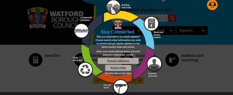
A standard overlay, which uses a centred logo with a good amount of white space and clear and simple call to action text, is straightforward and to the point. Providing a very basic overlay can speak to the broadest audience and gets subscribers in the door where they can then browse your full list of topics and make more specific choices. A great time to use a standard overlay is on your homepage, where most visitors land first. Here is an example of a standard overlay:

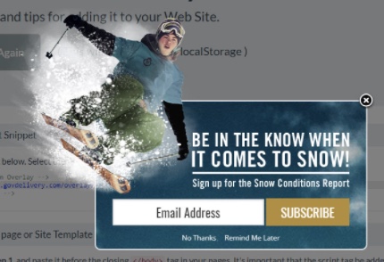
Advanced overlays require additional customisation beyond the standard options. Advanced overlays are typically graphic-intensive and allow you to express the values and promotional goals more directly and more attractively than a standard overlay. If you are a city planning board, for example, and have an upcoming music festival, you might consider using a graphic-centric overlay to convey the fun and excitement your audience will have attending the festival. Another good time to use graphic-centric overlays is to promote a specific topic in your account. This advanced overlay example is aimed at signing up for a snow conditions report:

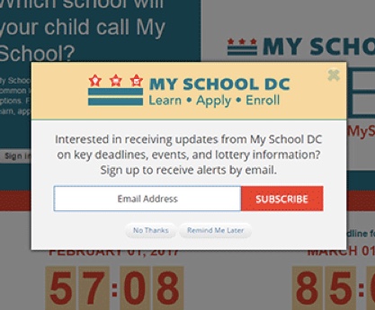
If your account is enabled to a multi-step overlay, you may also choose to collect more information from your visitors to better communicate with your audience. For example, a multi-step overlay might offer an SMS signup option to send text communications to your subscribers. You can either display the email and the SMS on the same first page of the overlay, or you can display the email on the first step, followed by a second step to insert their SMS number if they choose to. This can reduce subscription fatigue, where a subscriber sees a large number of fields to submit and abandons the signup form before they have submitted it. A multi-step process breaks the form up into easy-to-digest chunks, and also allows you to capture the subscription on step one. Here is an example of a multi-step overlay:

Which is followed by…

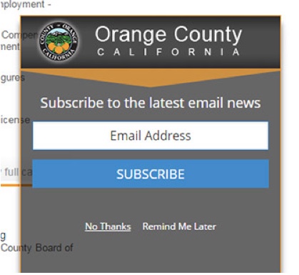
If you’re looking for an option that will blend in with your website and be less prominent, a slider might be the right option for your organisation. A slider is a type of overlay, but it only displays in the lower right hand corner of your website. Typically, a slider will only display the heading section at first, and the website visitor will open the rest of the slider by clicking on the heading. They will then be able to enter their email address and SMS number, and answer other questions that will make it easier and more effective to communicate with them. Sliders are typically simpler than overlays, but they also aren’t as impactful – you won’t see as dramatic an increase in subscribers with sliders as you would with overlays. Here is an example of a slider:

Overlays can be customised to be secure, accessible for people with disabilities, and mobile responsive. Plus, overlays prove to be the fastest and most effective method available for growing a digital audience, capable of achieving a 200 per cent to 650 per cent increase in the number of people who elect to hear from an organisation every day, driving up reach, which is one of the most important metrics for potential success. This means more website traffic, more video views and greater participation in your programmes and services.
Want to get started with an overlay? Contact your client success consultant if you’re already a Granicus customer, or email us at info@granicus.com for more information.